What if BeReal and Twitter had a baby?
Thirty-six hours, four designers, one question: how might we make social media feel less like a highlight reel and more like a real conversation? We came out of it as finalists with the Best UI award.
Wilfrid Laurier University
end to end
01Overview
UX Laurier is a designathon. You show up, they hand you a theme that morning, and thirty-six hours later you pitch a product to a room of judges. Ours was about using everyday life to build real relationships.
There were four of us, and in thirty-six hours everyone touches everything. What I want to be clear about is which parts of this were my calls, because that is the only useful thing a case study about a team project can tell you.
We took the theme in an obvious direction and then found the interesting part underneath. Social media is very good at connecting people and quite bad at making them feel connected. I did not want to build on that as an assumption, so the first thing I argued for was spending the first few hours asking instead of drawing.
Twenty-one people answered a survey about how they actually feel using these apps, and three of them sat down with us properly.
42% told us their interactions felt superficial. Not broken, not upsetting. Just thin. That is a harder problem than a bug, because nothing is visibly wrong.
How might we cultivate genuine connections by encouraging vulnerability and openness in a space that usually rewards the opposite?
02What I made
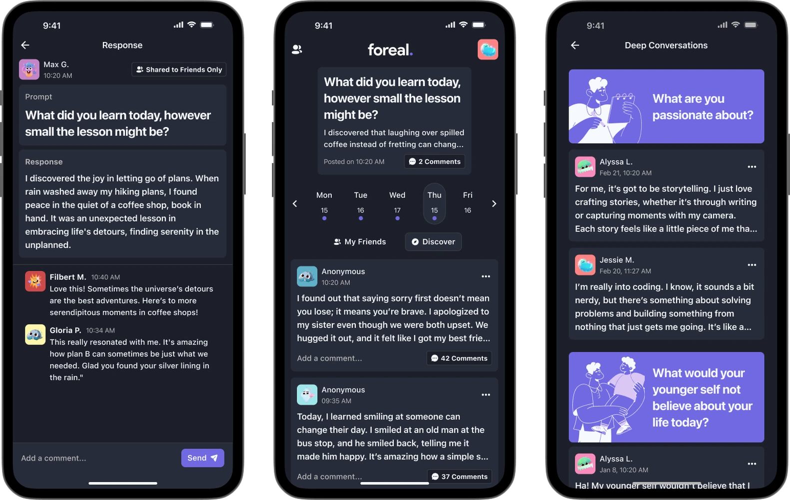
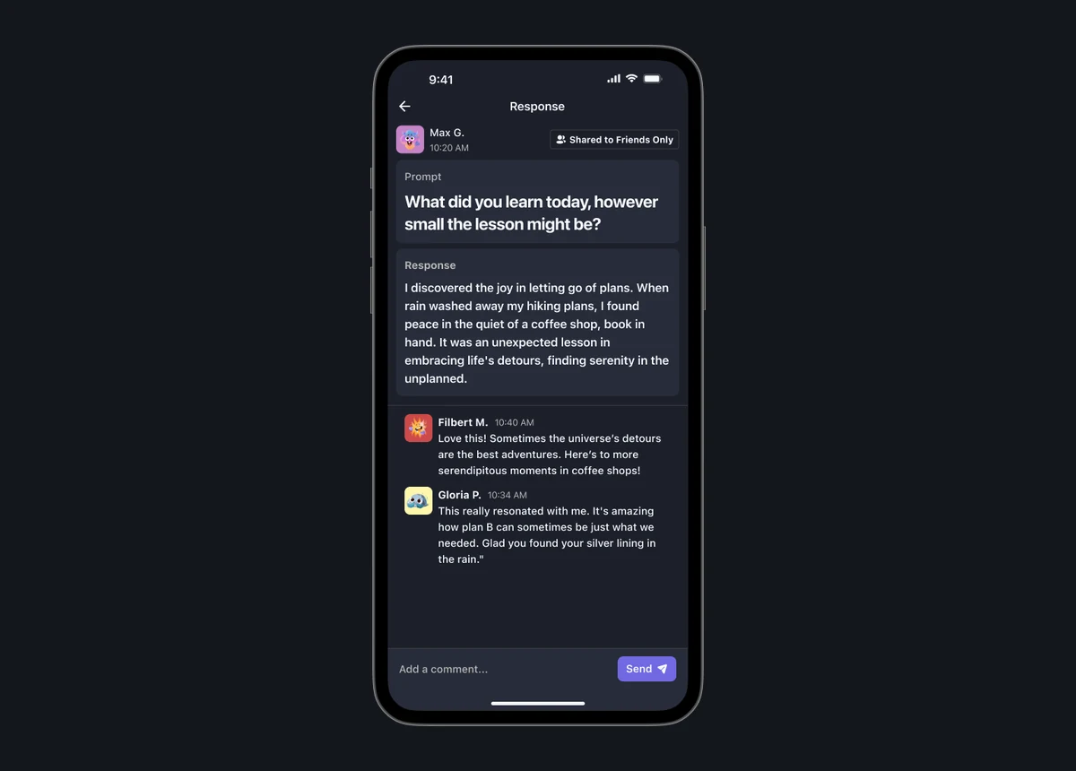
Foreal asks you one honest question a day. Not "what are you doing", which invites a photo of your lunch. Something like "what did you learn today, however small the lesson might be".
You answer it in words. Everyone else answering the same question that day is right there. That is the whole app, and every decision after this was about protecting it.
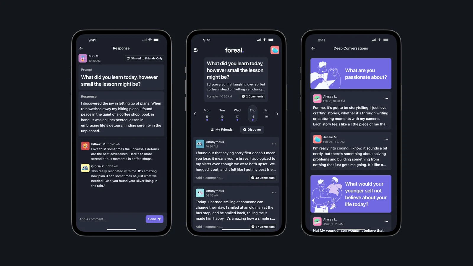
A question, not a feed
The prompt arrives once and then it waits. There is no algorithm choosing what you see next, and nothing that refills when you reach the bottom. The row of days along the top is deliberate too. It shows you the question you answered yesterday, so the app has a memory rather than an appetite. When you have answered, it is finished with you for the day.
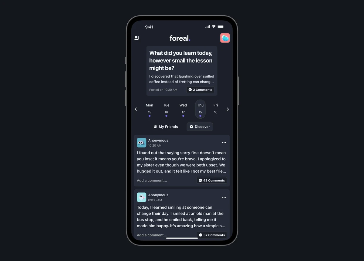
Somewhere worth reading
Everyone answering the same question is in one place, so the thing you read is other people thinking about exactly what you just thought about. That is the difference between a feed and a conversation. Answers are text first, because a photo lets you perform and a sentence makes you commit.
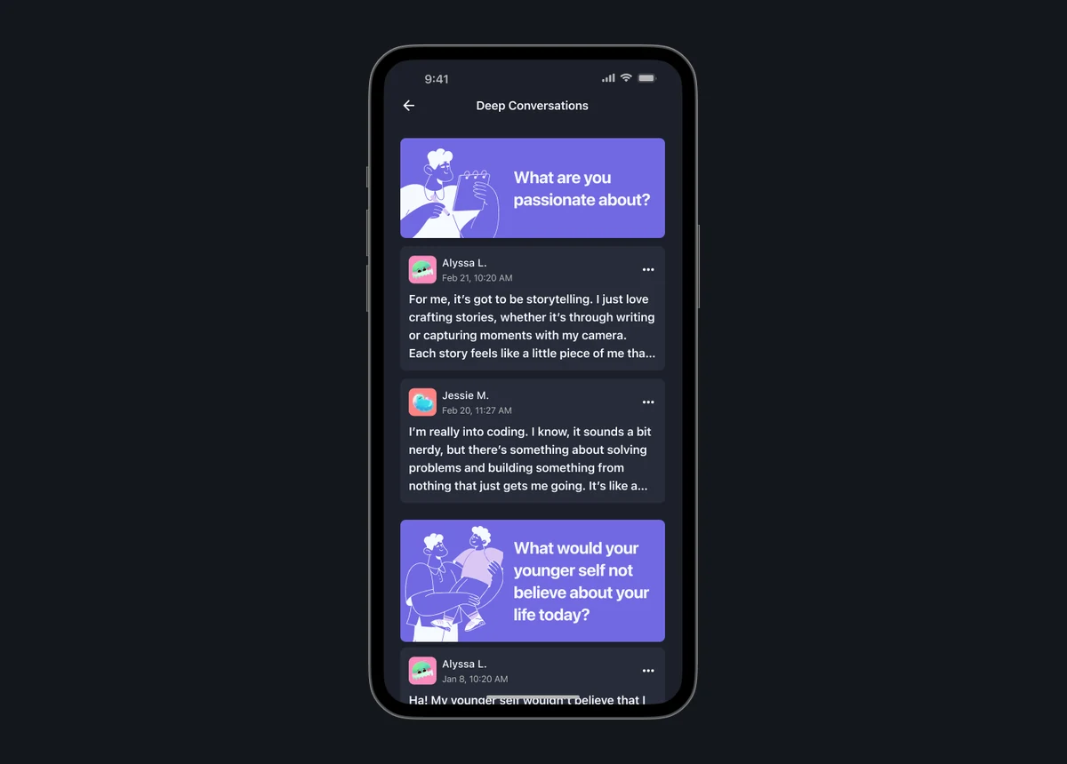
Answer as yourself, or not
Every answer can go to your friends, to everyone, or to nobody but you, and you can post without your name on it. The control sits on the post itself rather than in settings, and it says out loud who will see this before you write a word. That placement was mine, and it came out of one interview that is in the next section.
Nothing to win
No streaks, no scores, no levels of friendship. We built all three and then cut them, which is the most interesting thing that happened in the thirty-six hours and gets its own section below.
The pitch and demo
Six minutes, including the walkthrough we gave the judges.
03Key design moments
One interview changed the whole privacy model
I ran the interviews. The survey had given us the shape of the problem and the interviews gave me the reason. 71% said they wanted the option to post anonymously, which on its own is just a number. Then David told me what the number was made of.
As someone in the LGBTQ+ community, I have not come out to my friends and family yet. I like to share my feelings to help others feel less alone, but keep it anonymous until I'm ready for my circle to know.
David, 19
We had been treating anonymity as a privacy setting. It is not. For some people it is the only way the post happens at all. That is the moment I stopped designing a settings page and started designing a control that sits next to the thing you are writing.
The other two wanted the opposite and said so clearly. One only ever shares as herself. So I stopped trying to pick a side. The design decision was to make the choice cheap, visible, and repeated on every single post, which is why it is on the compose screen above and not three taps away.
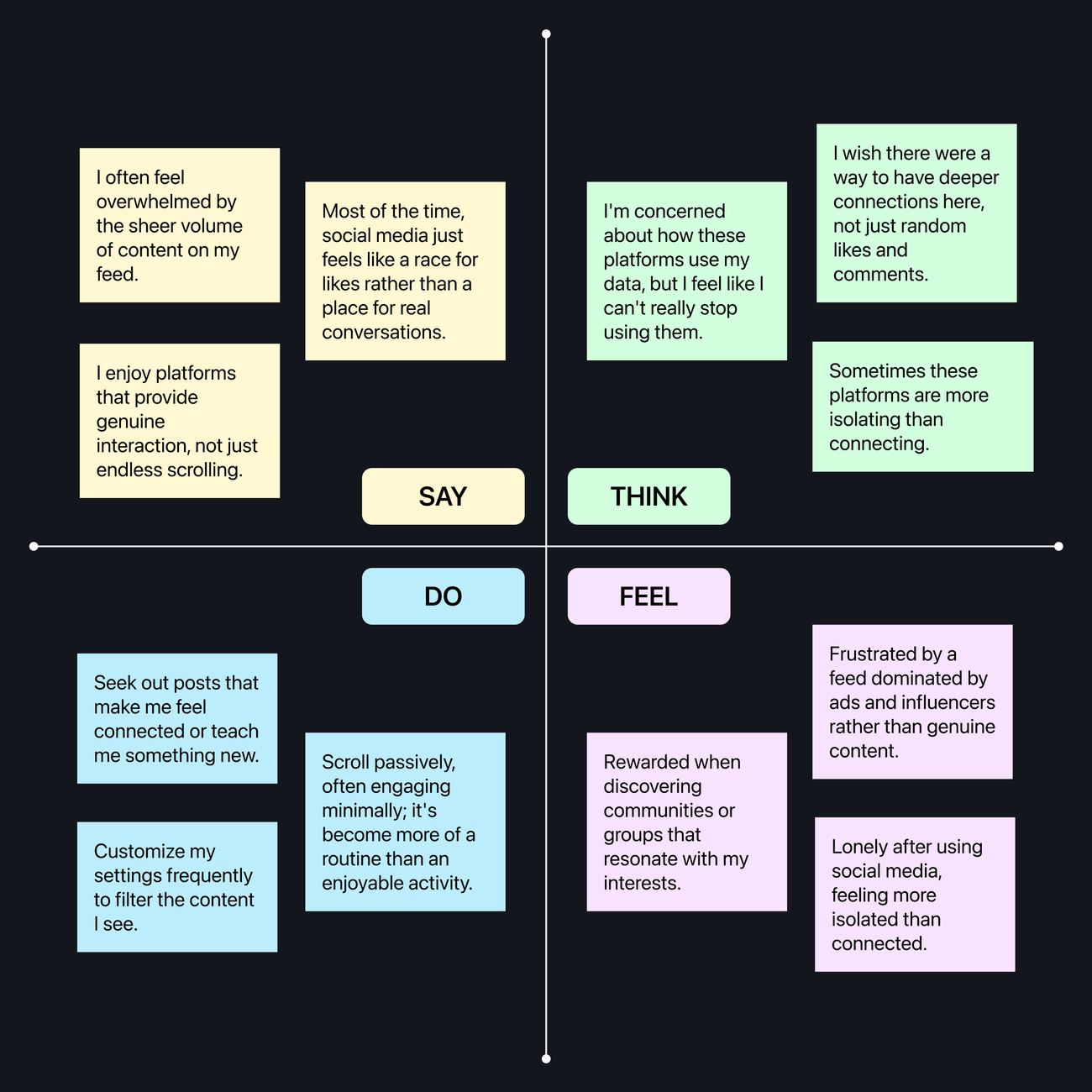
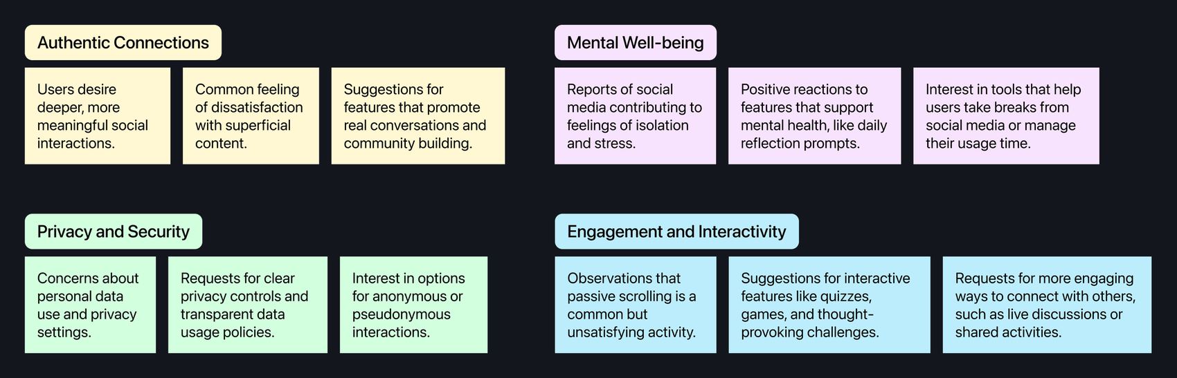
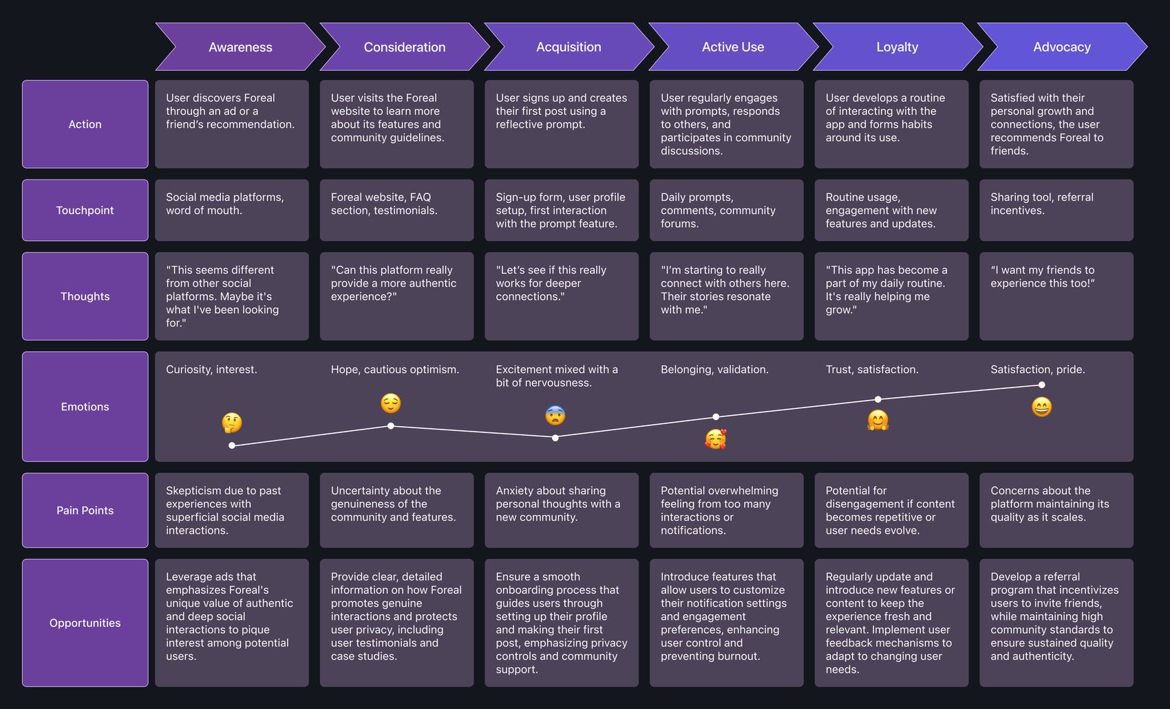
Then we mapped the experience end to end together, so the features had somewhere to sit instead of being a list.
Three apps had already tried this
Good ideas in this space are not rare, and the fastest way to waste thirty-six hours is to rebuild something that exists. So we surveyed fifteen users each of BeReal, Locket and 5 minute journal, and I put the results into one table.
Each one has a piece of it. BeReal has the honesty but nothing to say. Locket has the intimacy but only with the two or three people on your lock screen. 5 minute journal has the reflection but keeps it entirely to yourself, and scored the highest of the three at 80% satisfaction because of it.
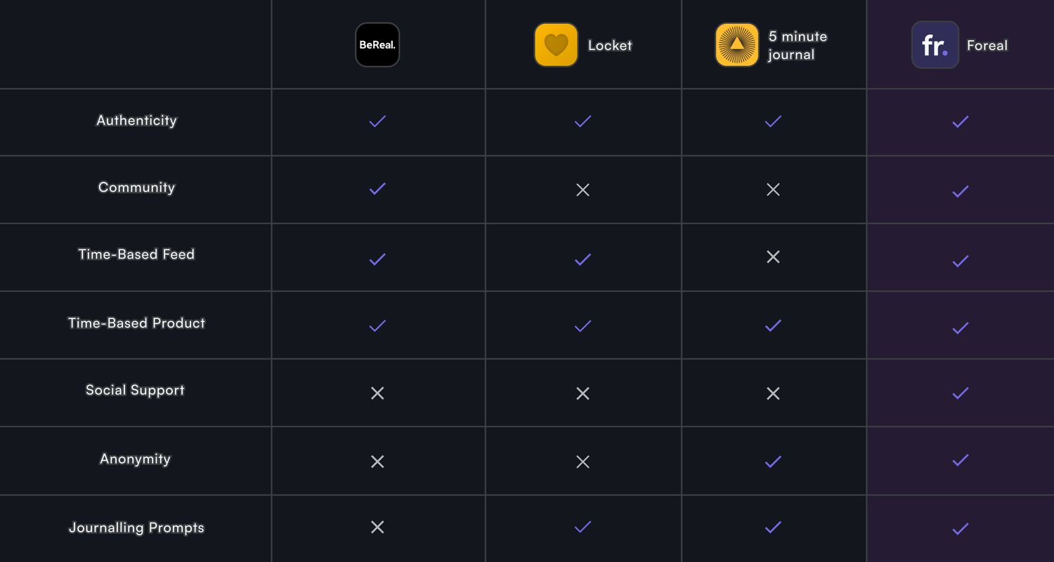
Nobody was doing reflection and community in the same place. That gap became the whole product, and having it written down by hour four is why the rest of the day was building rather than arguing.
We built streaks, and then took them out
By the middle of the night we had gamification in. Friendship levels that went up the more you talked to someone. Streaks for answering every day. XP for going deeper. It looked great and it tested badly.
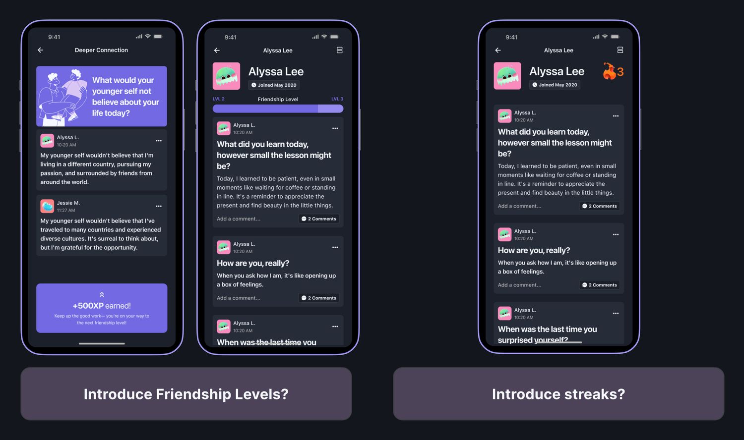
We put it in front of three people from our target group. All three said the same thing without being asked.
That stung, because it was the fun part to design. It was also completely right. We had built the exact thing we set out to fix, and it had taken us about five hours to do it. Arguing to throw those five hours away, with twelve left on the clock, was the hardest thing I did all weekend.
The compromise we reached for first. It does not help. The problem is not who sees the number, it is that a number exists at all. Once you are counting, you are optimizing, and honesty comes second.
Streaks felt more innocent. But a streak is a punishment you have not received yet. It turns a question you wanted to answer into one you have to, which is the opposite of the point.
No scores, no levels, no streaks. The only reason to open Foreal is that you want to answer the question. If that is not reason enough, a number on a screen was never going to fix it.
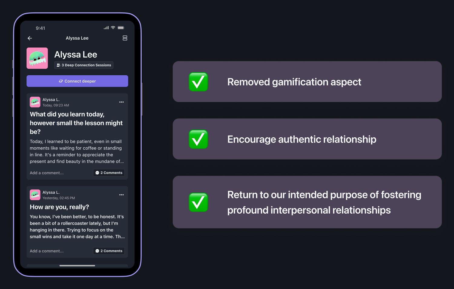
Cutting a feature in hour twenty of thirty-six, when you are tired and the screens already look finished, is not a natural thing to do. It is also the decision the judges singled out.
Thirty-six hours, and the parts nobody sees
The reason we could cut a whole feature that late is that we had not been precious earlier. It went wide first, on purpose.
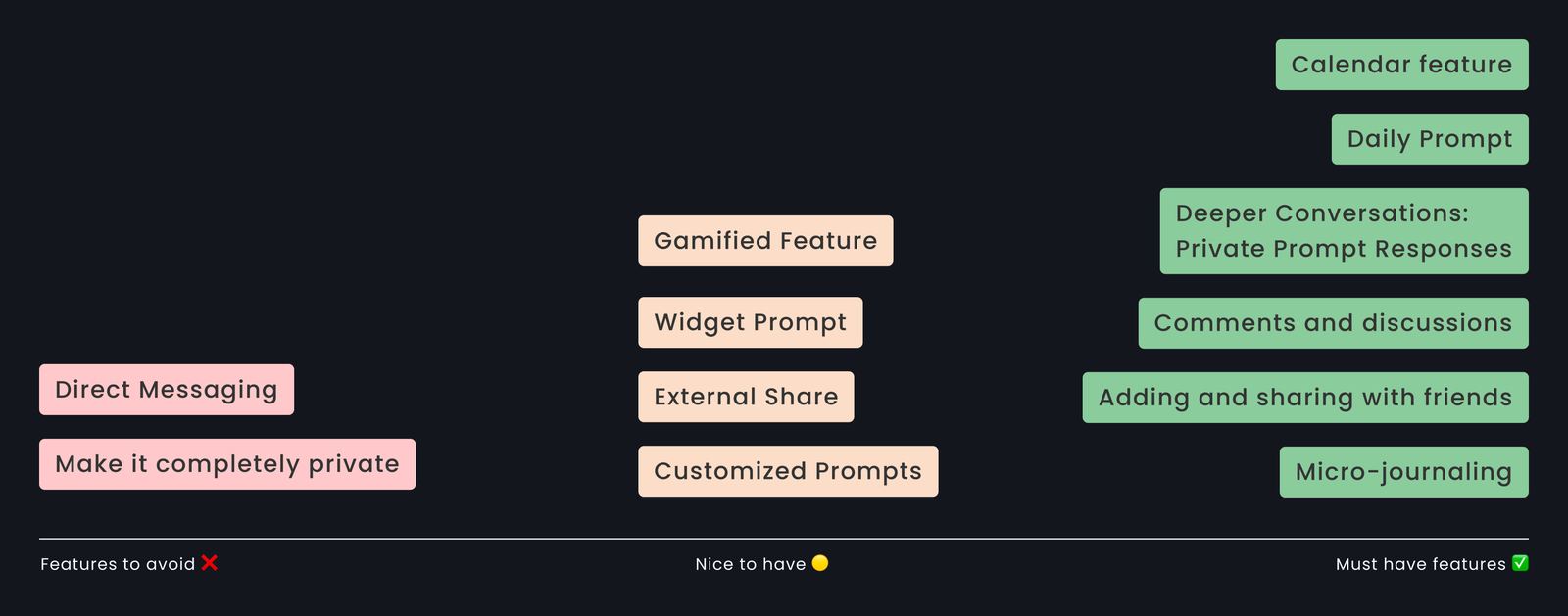
Then narrow, one flow at a time, so we knew what each screen had to do before anyone drew it.
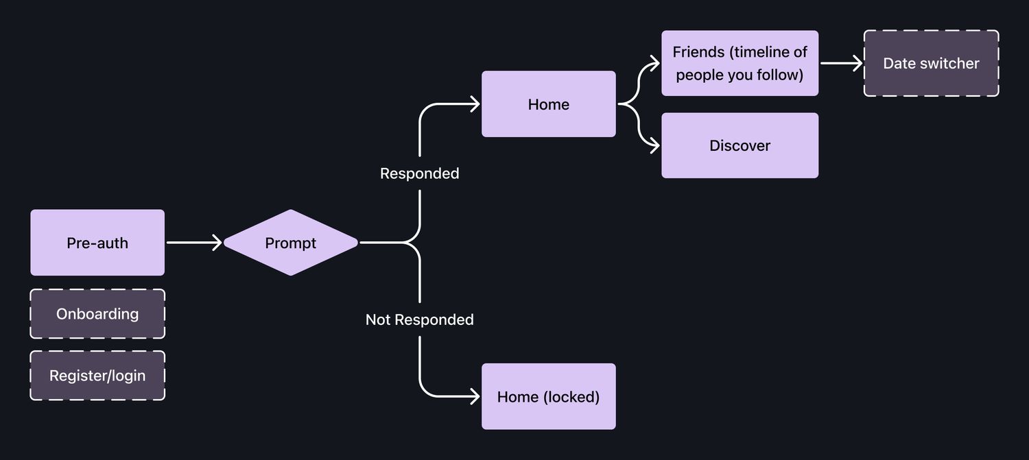
Everything started grey and rough, so nothing was expensive to throw away.
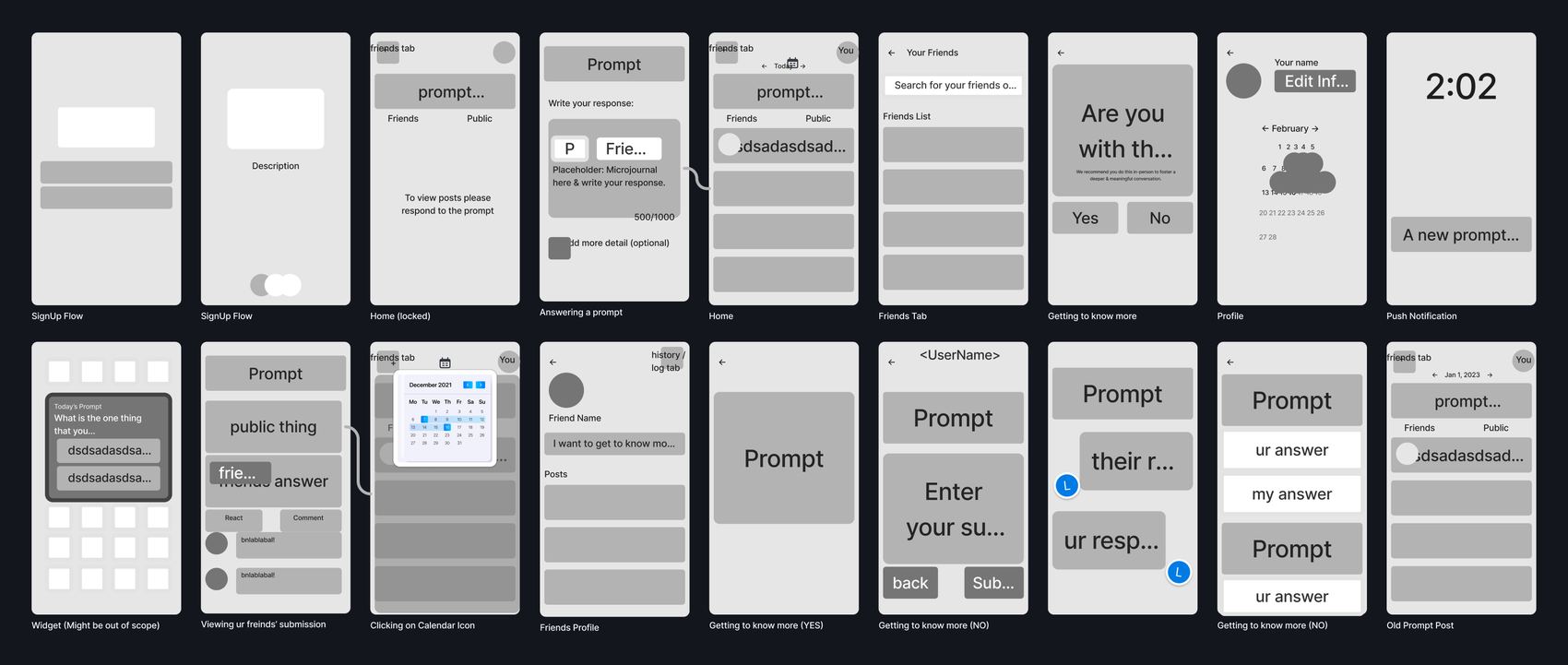
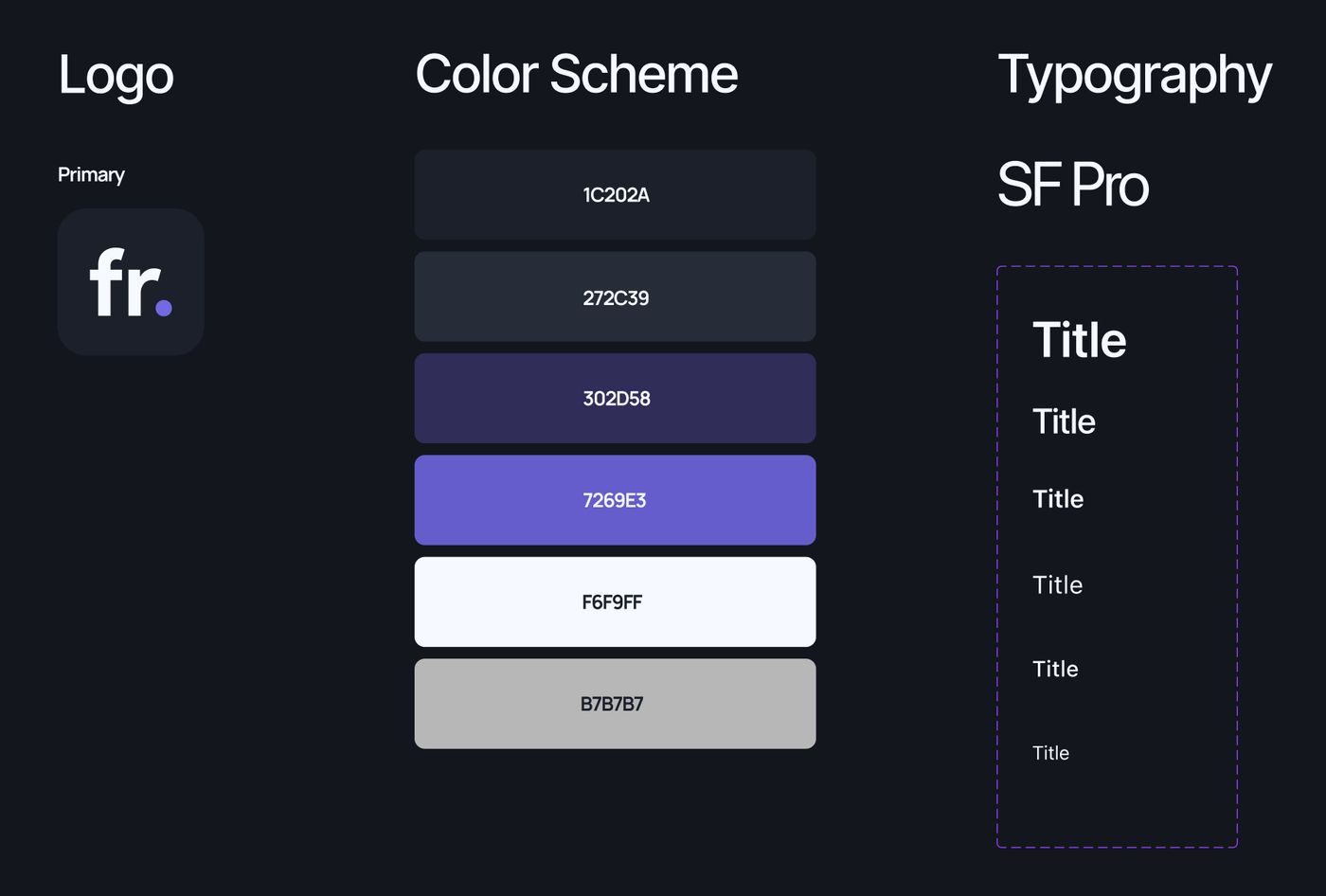
The look came after the flows were settled, in about two hours, which is why it is consistent. One typeface, six colors, and a rule that the app should feel like a quiet room, not a stage.
04Impact
What the judges said mattered more to me than the placing, because they picked out the decisions rather than the pixels.
They also told us what we got wrong, and it was fair. We pitched the solution before the research. One judge said they spent the first half of our presentation quietly wondering whether the problem was real, and only got the answer at the end. The work was in the right order. The talking was not.
05Reflections
Points ruin the thing they measure
We added streaks because they are fun to design and everyone expects them. Three people told us that counting a friendship makes it less of one. If your product asks people to be honest, you cannot also ask them to keep a score, because the moment there is a number, the honesty is competing with it. I will spot that faster next time.
Research is not a stage you finish
Our best decision came from one sentence in one interview, and I would have missed it if I had treated research as the box you tick before the real work. The number told me anonymity mattered. Only the person told me why, and the why is what I actually designed against.