Giving the right access to the right people
The User Admin tool is where 73 of SeatGeek's rightsholder clients decide who gets into SeatGeek Enterprise, roughly 80% of the entire enterprise client base. It was built by engineers, for a world with one app. I redesigned it for many.
enterprise
New York
01Overview
SeatGeek Enterprise is the software behind ticketing for venues, sports teams, and live entertainment. Before anyone at a club can sell a ticket, settle a payment, or look at a fan's data, an admin has to let them in. That happens in the User Admin tool.
The tool was built engineering-first and shipped to production without a single design pass. It worked. 377 client admins use it every month, and it is the front door to the entire enterprise platform. But nobody had designed it around the person clicking through it.
That had already cost something real. The Minnesota Wild rollout was rolled back, not because anything was broken in the backend, but because the tool was too confusing to trust. When a tool grants access this sensitive, admins who are not confident stop using it, and mistakes get expensive.
How might we make the User Management app clear and trustworthy enough that any client admin can grant exactly the right access, confidently and without fear of mistakes?
The timing mattered too. SeatGeek was moving to a multi-domain model. Today the tool grants access to one app. Next, one client organization can have several domains, and every domain runs its own instance of each app. The old tool could not stretch that far.
more
02What I made

Meet James. He runs systems for Manchester United and he is the only person there allowed to create a user, remove one, or change what anyone can see. Ninety four people across ticketing, marketing, CRM and IT, in a club listed on the New York Stock Exchange, which makes him the audit holder too.
He opens the tool about once a week, and he keeps an approval form open in another window the whole time, because the tool cannot tell him who changed what. I designed everything against his week.

A new hire starts today
James opens the tool to give her access to the apps she will use every day. Before, that meant bouncing between screens, and creating the account never prompted him to set permissions at all.

Now it is one guided pass. Creating the account and setting what she can reach happen in the same place, in the order he would do them anyway.
Someone changes teams

Dana just moved to a new team, so she needs different access and different permissions. Before, that meant hunting through several places and trusting he had not missed one.

Now the whole change happens on one screen, with guardrails that show what will actually change before it does.
James forgets his own password

Then one Tuesday after a long weekend, James cannot remember his own password.
Before, there was nothing he could do about that alone. He waited on another admin, or on SeatGeek product support, while somebody set a new one by hand. Until they replied he was locked out of the tool he is in charge of. There is no before to show here, because there was no flow at all.
Now he resets it himself. The reset routes to wherever his account actually lives, his own company's identity provider or SeatGeek's, and for the accounts with no email address the admin can still send a link.
03Key design moments
It was not just James
One admin is a story, not a case. I started where I could start alone, by reviewing every screen in the tool against usability heuristics and logging what I found. Forty plus findings later I had a map of what was broken.
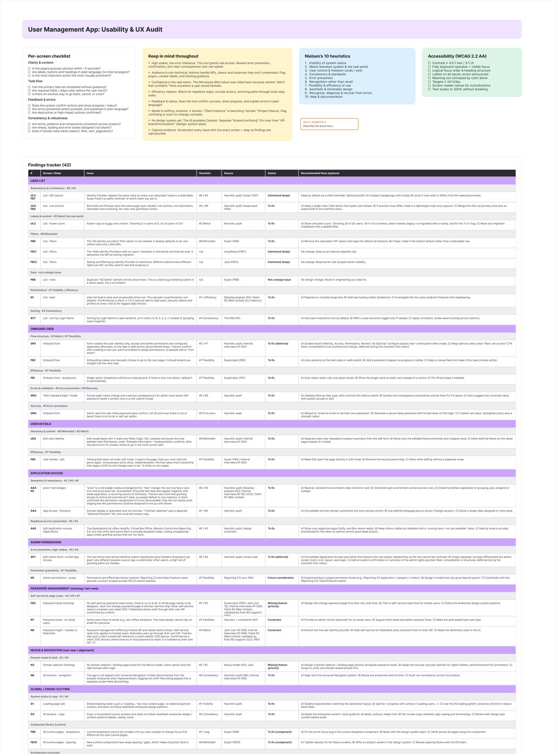
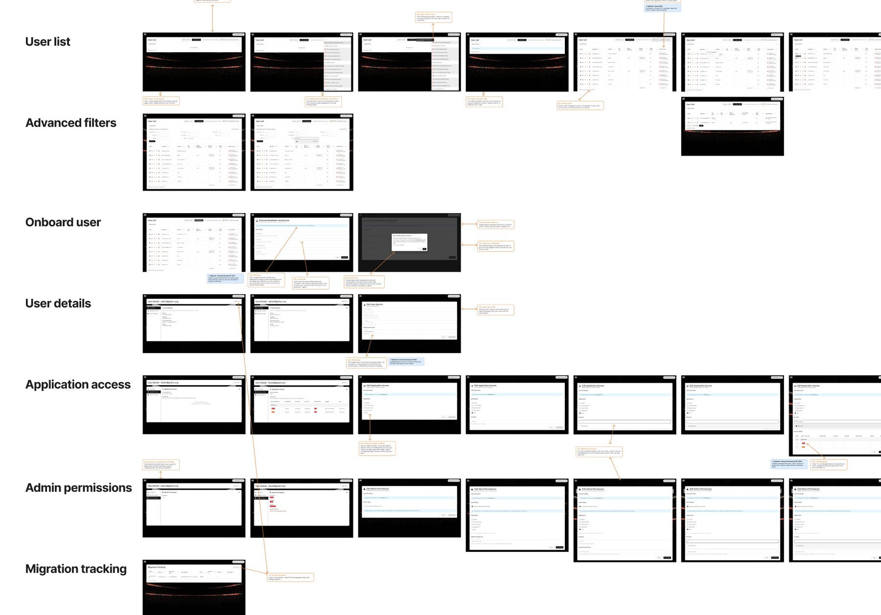
The audit told me what was broken. It could not tell me what actually hurt. So I ran two rounds of interviews. First three SeatGeek experts who train and implement for clients. Then the clients themselves, including the ticket operations team at Manchester United, and the product support person who fields the tickets after onboarding goes wrong.
James has twelve years on the old platform and one month on this one. He found it confusing, and he knows the system better than almost anyone.
Five themes came back, and only two of them were about speed.
Editing sent you through a multi-screen redirect, and creating a user never prompted for permissions.
Admin permissions and app access looked almost identical but granted very different power.
No self-serve password reset, no domain selector, no safe place to test.
Dense jargon, bare empty states, and a red badge that read as an error when it was not one.
Internal staff could not see what a client sees, so demos and walkthroughs were guesswork.
The telemetry agreed with them. I went through six months of Datadog and found no crash storm at all. What I found instead was rage clicking, long dwell times on the three core flows, three second page loads, and a list that had timed out 107 times in four months. The tool was not breaking. People were.
Turning a pile of complaints into a plan
Five themes and forty findings is still just a pile. Before I could design anything I had to know what the tool actually is, and what it needed to become.
Current state on the left, future state on the right. Drag the handle to see what changed.
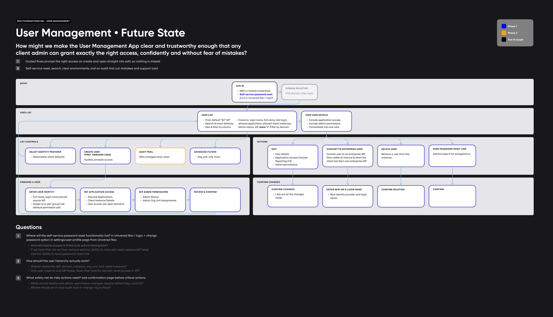 Future
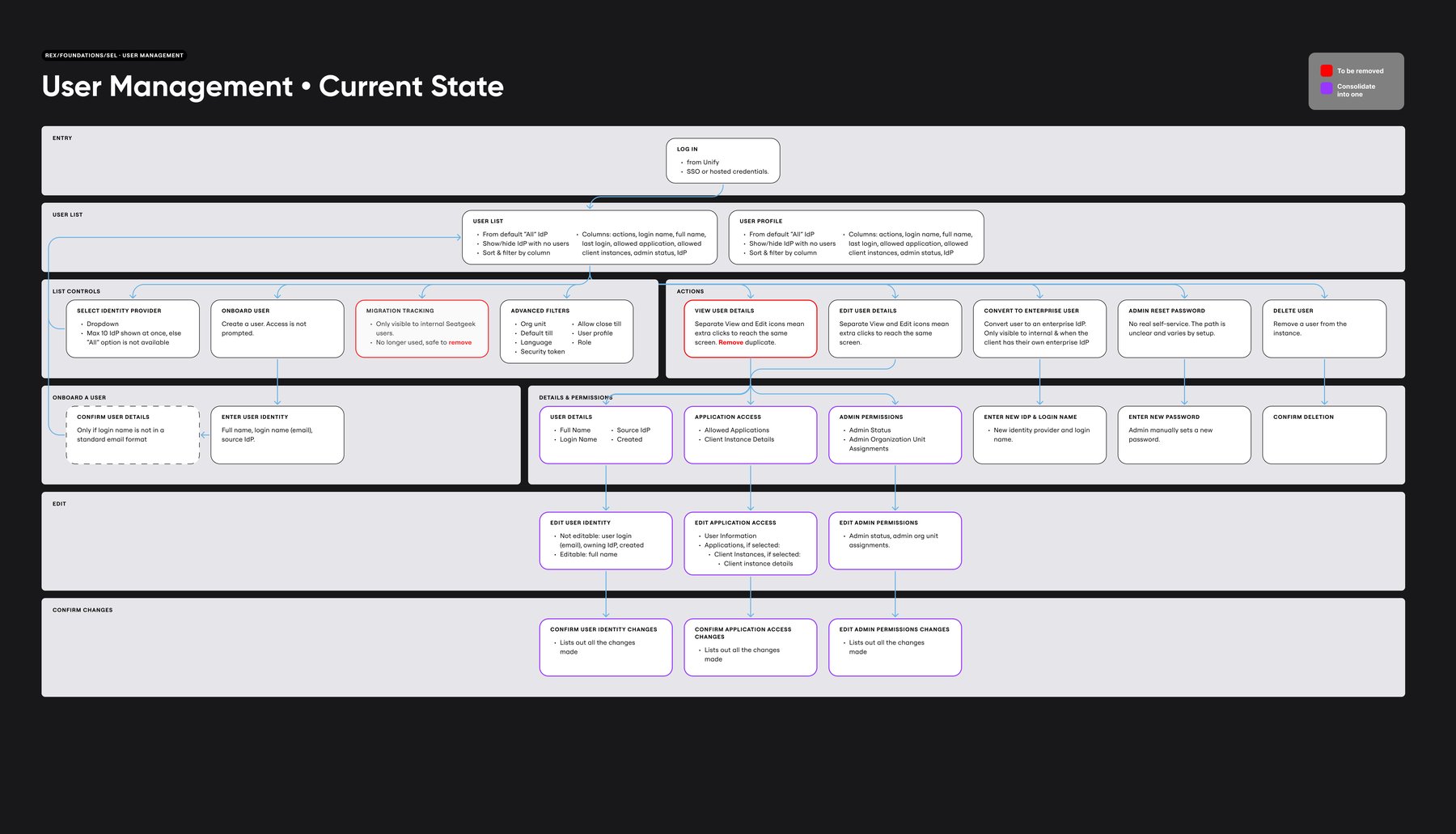 Current
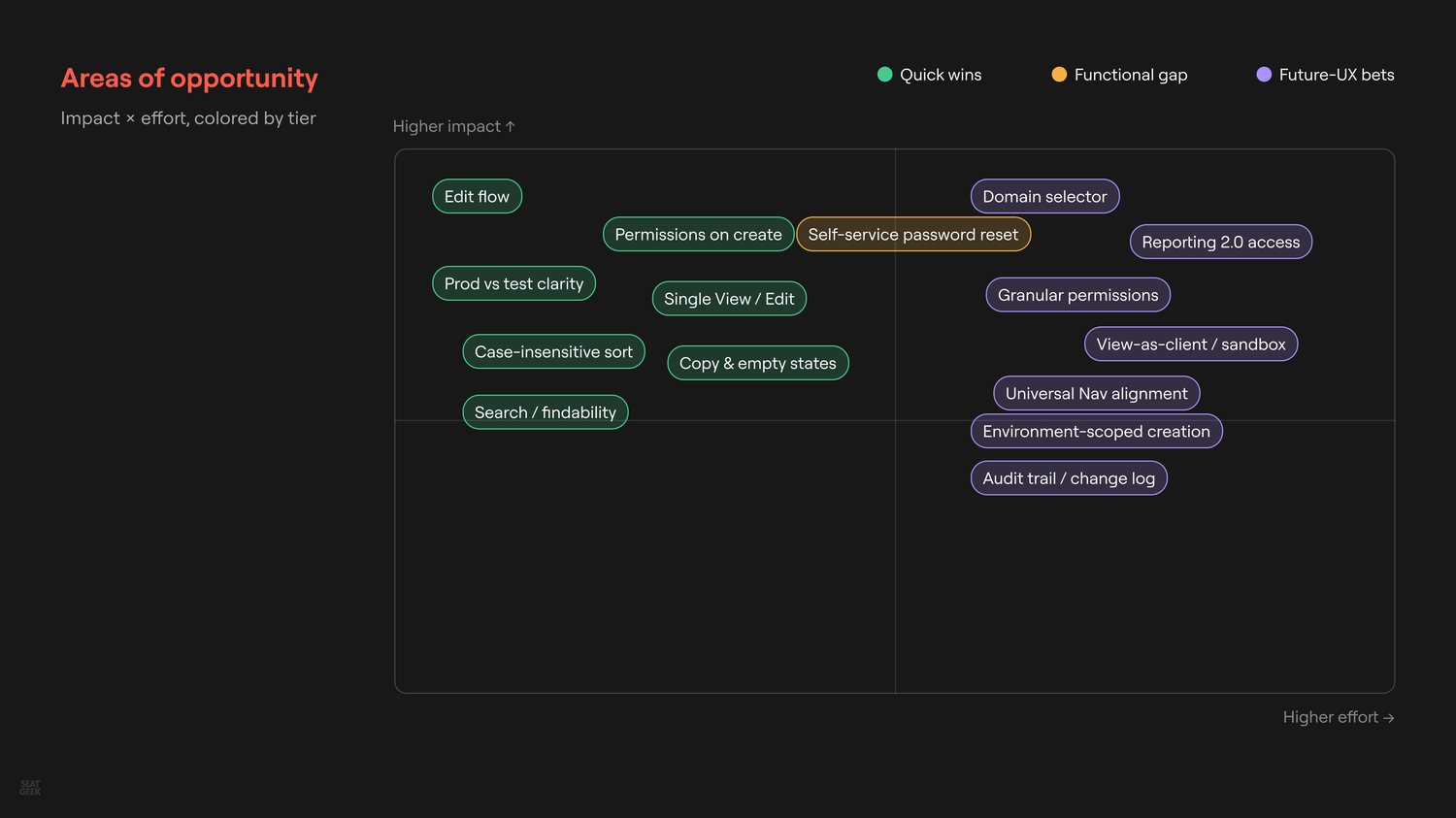
That left a long list of things worth fixing and no agreement on order, so I plotted every one of them by impact and effort. It turned a wish list into a sequence we could argue about with evidence.
Then I put the top of that list in front of the team and we drew on it together, which is how the solutions stopped being only mine.

The two tabs that looked the same
The clearest example of theme two sat in one screen. Admin permissions and application access lived in two tabs that looked almost identical, and one of them granted far more power than the other. You could make someone an administrator while you thought you were giving them a report. This is the decision I spent the longest on.
Three ways out came up, and two of them did not survive contact with how the tool is actually used.
Raised by the engineering lead in a knowledge transfer, and it is tempting until you follow it through. If admin is hidden until someone is an admin, nobody can grant the first one.
I proposed this in the workshop and it is genuinely good, so it is in the plan. It is not the answer to this problem though. Groups help the routine cases. Mistakes happen in the off-menu ones.
Admin permissions moved out of a lookalike tab into their own step, and every high-stakes change now has to pass a screen that states the before and after in plain words.
The last one only works if the review screen is actually readable, and the old confirmation dialogs were not. They were dense, and people clicked past them. So this one lists one line per change, old value struck through, new value in bold, and nothing commits until you have been shown it.
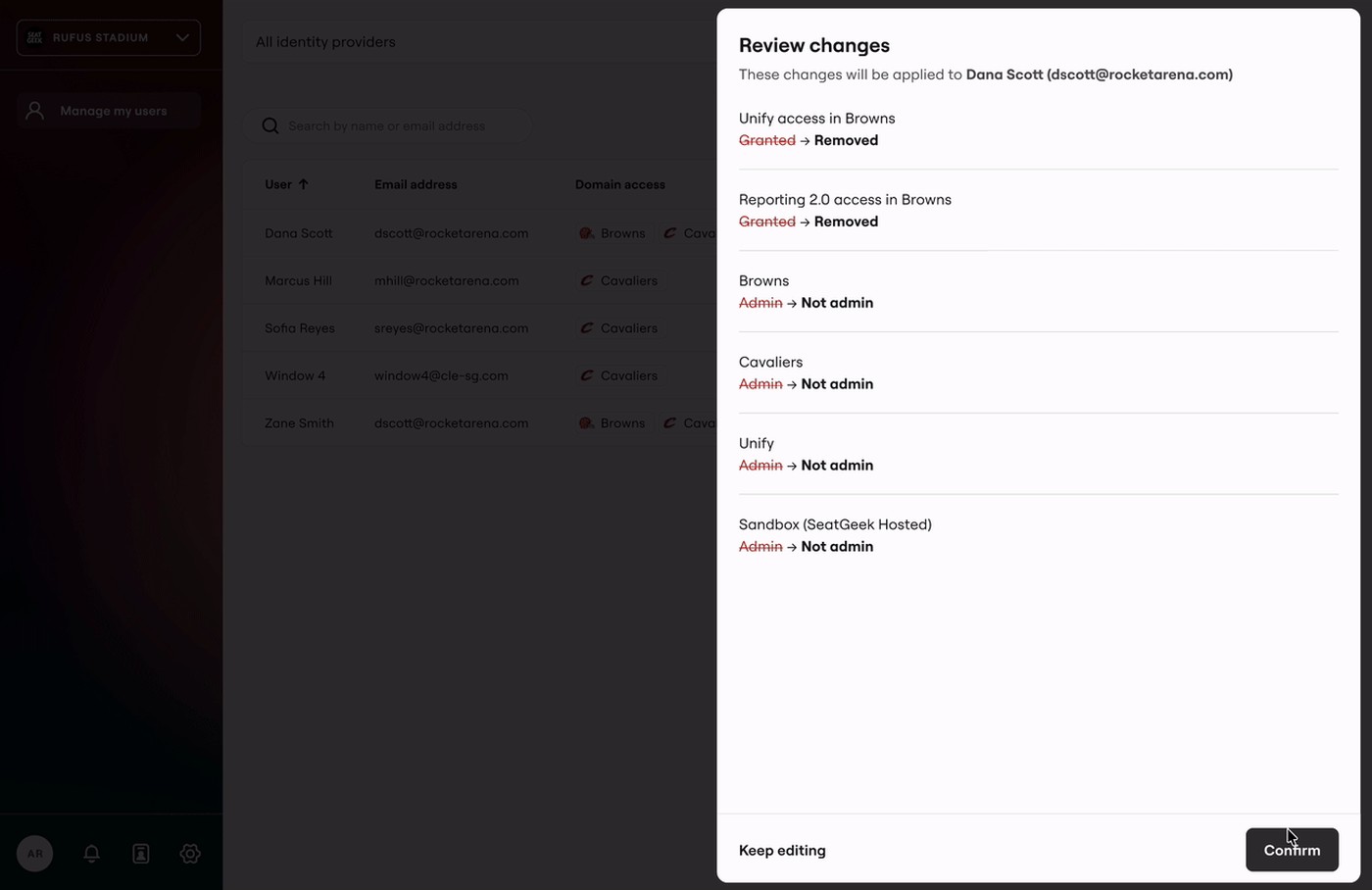
That is what I mean by sure instead of fast. It adds a screen. It is still fewer clicks than before, and now every screen answers two questions before you commit: who has what, and what will this change actually do?
Five unmoderated tests later
I ran five unmoderated tests on the prototype, covering the three flows that mattered: create a user, change someone's access, and help someone locked out. Everyone got through creating a user and changing access. Ease scores told the real story. Creating scored 6.2 out of 7, helping a locked-out user scored 6.8, and editing an existing person's permissions scored 4.6. That was the flow still doing too much thinking out loud.
Confidence ratings said the same thing more bluntly. Resetting a password scored a perfect 5 out of 5 from every single tester. Creating a user scored 4.4. Changing an existing person's permissions scored 3.6, which is the number I would put in front of the next designer on this.
The tests also settled what to build first. Product support had told me something I kept coming back to: they barely get tickets about this tool at all, but when they do, it is almost always a password reset. It was the smallest thing to build, it was the one piece of pain support actually felt, and it tested the best of anything I made. So it went first.
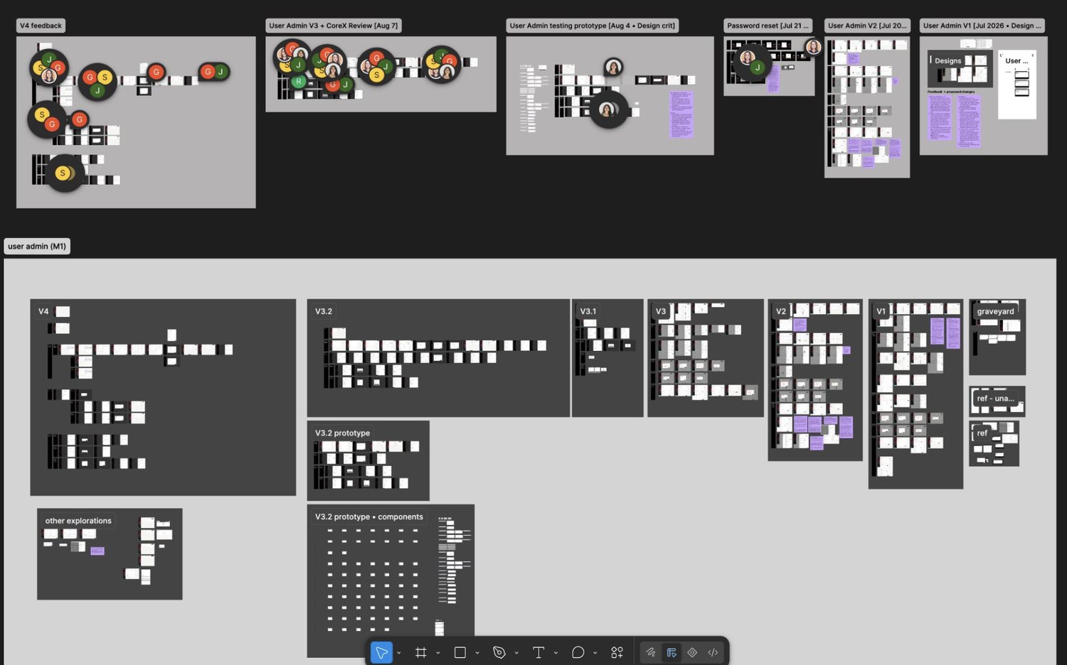
Four rounds, several design crits, and a graveyard of ideas that did not survive them. This is what the summer actually looked like.
04Impact
Measured against the current tool in prototype testing with five admins. The build starts next quarter, so these are the numbers I handed over, not shipped results.
Recapping, the business outcome we expect is this. Clients run access themselves and feel sure while doing it. SeatGeek gets faster rollouts, fewer support escalations, and less risk on the data that matters most as the enterprise products scale.
I presented the work to the CTO, the head of enterprise, and the directors at the end of the summer. It landed well, and the redesign is scheduled to be implemented next quarter. Password reset is in development now, the core redesign is next, and the nice to haves are queued behind it.
05Reflections
Confidence beats speed
I came in trying to cut clicks, and clicks turned out to be the easy part. People were a little afraid of this tool, and a faster way to make a scary mistake is not an improvement. Once I designed for certainty instead of speed, the flows got simpler on their own and the click count came down anyway.
Design for the job, not the client
Every client asked for something different, and for a while I tried to hold all of it. Underneath, the job was almost always the same. One screen could answer five different requests once I designed for the job instead of the request.