Helping product teams work with AI agents
IBM's Productivity Assistant was an internal AI chat that almost nobody used. Over sixteen months I helped turn it into a home for eleven agents that now handles around 1,100 messages a day.
AI for Product Teams
then design contractor
Toronto
Carbon Design System
01Overview
Product teams do a lot of work that nobody enjoys. Writing up research, drafting epics, turning a messy transcript into something a team can act on. IBM's AI for Product Teams initiative exists to hand that work to generative AI so people can spend their time on the parts that need a human.
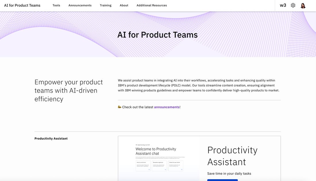
In October 2024 the team launched Productivity Assistant, an internal AI chat trained on IBM's product development lifecycle. It did not land. Other approved tools did the same jobs better, and adoption sat close to zero.
That is the part worth sitting with. It was not broken. It answered questions. It just gave people no reason to come back, and inside a company the size of IBM a tool nobody opens is the same as a tool that does not exist.

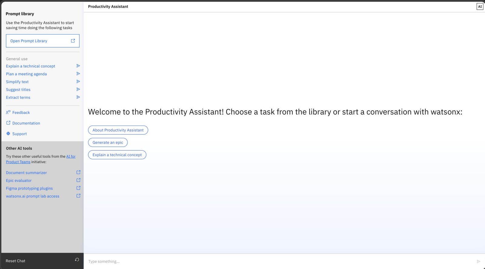
Underneath, the assistant ran on what the team called task accelerators. Each one was a single skill that did a single thing. Explain a technical concept. Plan a meeting agenda. Simplify text. You picked one off a list, fed it something, got an answer back, and that was the end of it.
That holds up right until the work has a second step, which it always does. Writing an epic is not one move. It is a draft, then a rewrite, then the user stories that come out of it. With accelerators every one of those is a cold start where you paste back in the thing you just made.
Once the epic is created, I wish I could get user stories automatically, and not have to provide the epic I've just generated all over again.
And agents are not just bigger accelerators. They are a different shape. An agent holds a conversation, keeps what you told it, and belongs to a discipline rather than a task. Eleven of those do not fit in a list of prompts. That is what made this a redesign and not a tidy-up.
I joined in January 2025 as the design intern on it, and stayed on as a contractor through to May 2026.
How might we make an AI assistant people actually reach for, one that is clear about what it can do, honest about what it cannot, and able to grow as the agents behind it multiply?
02What I made
Picture a product manager at IBM with an epic to write before standup. She has done this a hundred times. She knows roughly what it should say.
She opens the assistant, explains the feature, gets a decent draft, copies it into Aha. Next week, same task, and the assistant remembers none of it, so she explains the whole thing again. She stops opening it. Not because it failed. Because it never got any easier.
Chat log reviews and a survey turned that feeling into three specific problems, and the order I fixed them in was the actual design decision.
The interface ignored the Carbon Design System, so it felt like a side project rather than a supported tool.
Task accelerators were one-shot. Agents hold a conversation. The old layout had nowhere to put them.
An empty box and a blinking cursor. People free-prompted, got mixed results, and drew their own conclusions.
First, make it look like it belongs here
Iteration one moved the whole interface onto Carbon. Nothing new, nothing clever. It just stopped looking like something you should not trust with work.
Then, make room for what was coming
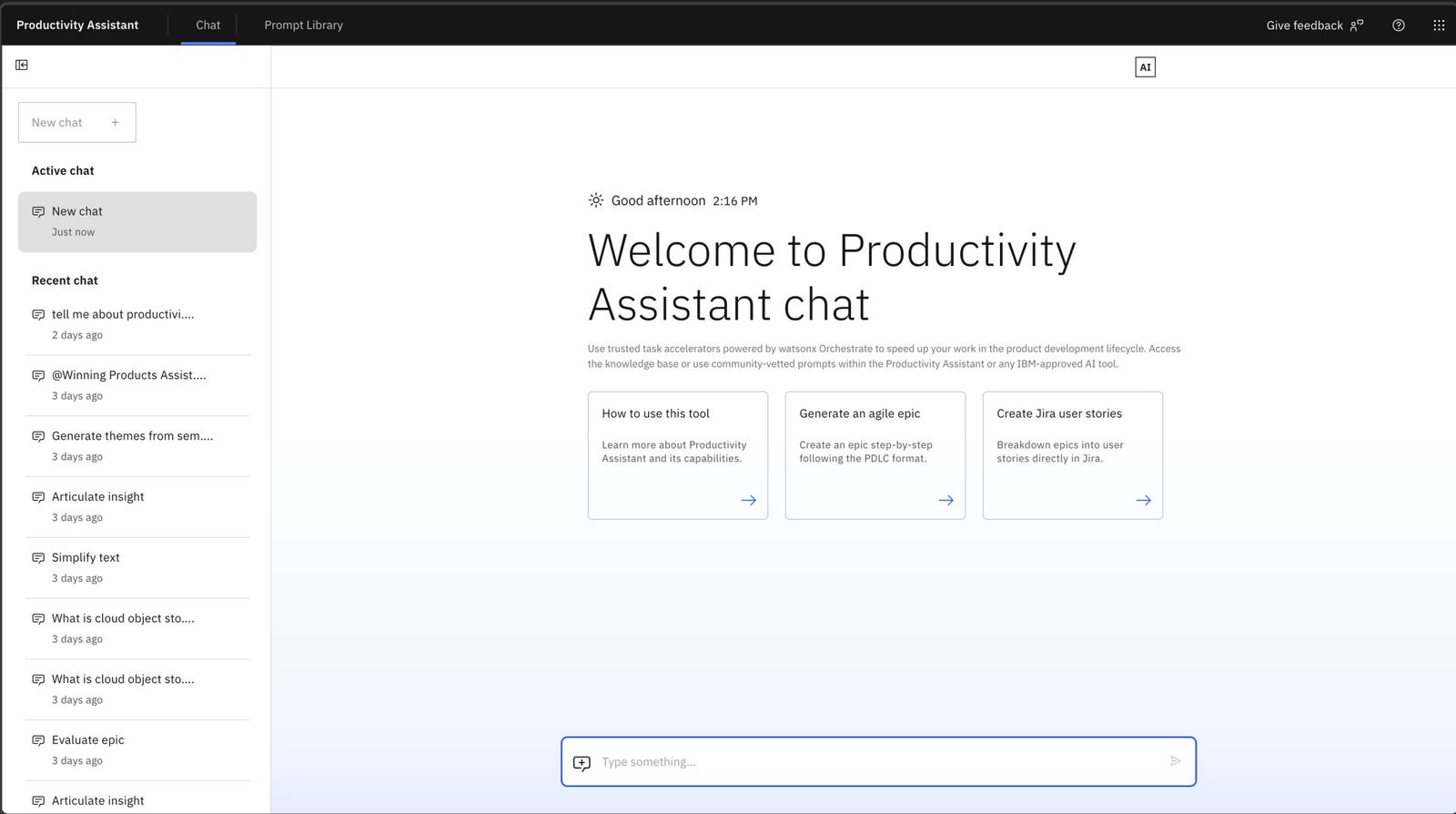
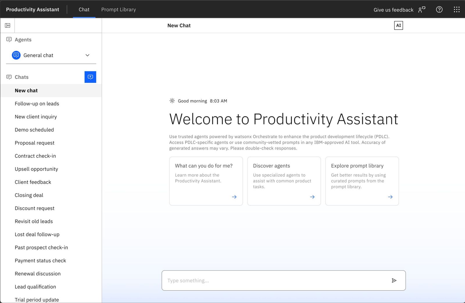
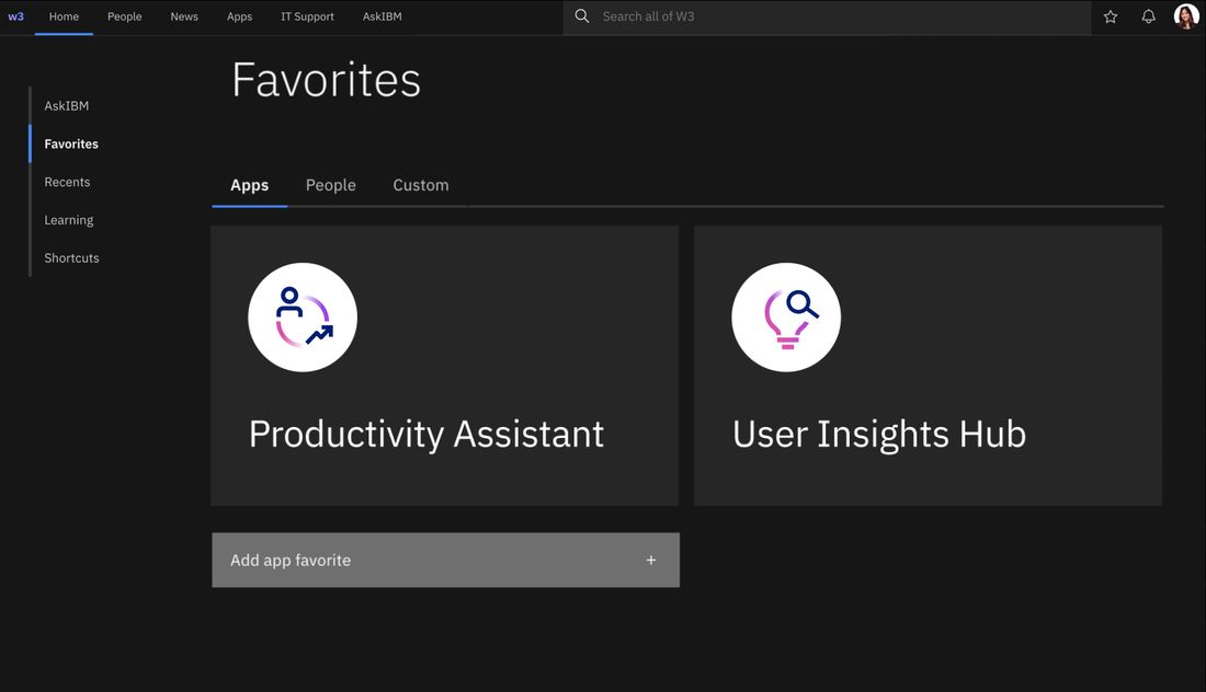
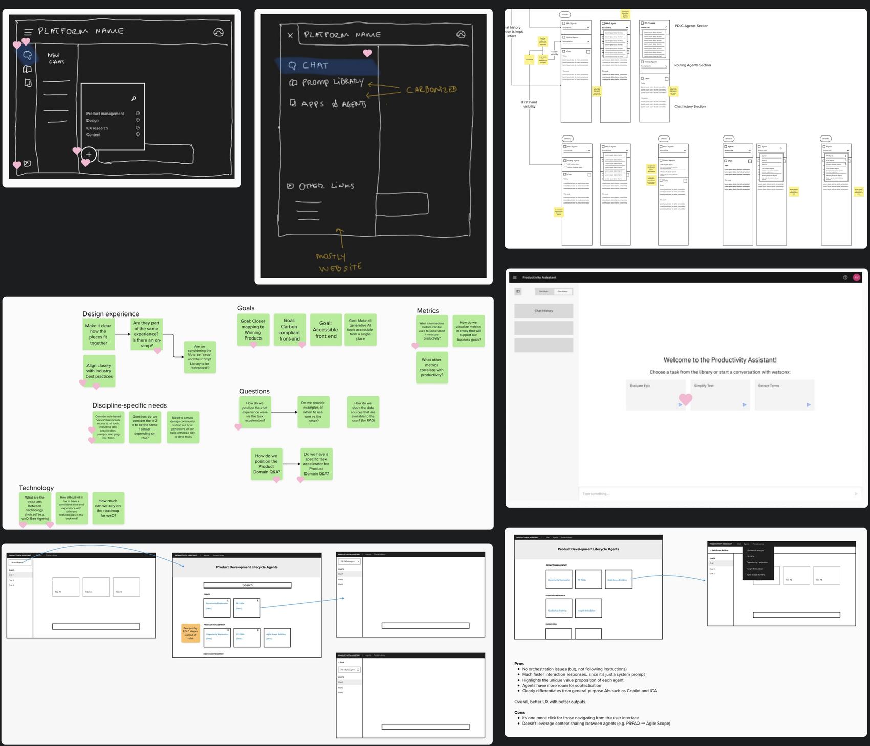
Iteration two rebuilt the left side around agents rather than a list of skills. You pick who you are talking to, then you talk, and the conversation stays with them. It holds eleven agents and whatever comes after them, because adding one is adding a row, not redesigning a page.
Then we tried to explain it, and got it wrong
The third problem was that nobody knew what to ask it, so I built onboarding. Three short panels on first open: what the assistant does, what the task accelerators do, and how the chat works. It was the clearest thing I made all year.

We tested it with seventeen people. Not one of them clicked through it. Every single person dismissed it and went straight to the chat box. So we scrapped it, and the job it was supposed to do moved into the agents themselves, which is the next section.
Iteration four tightened the rest for launch. Two problems closed by design, and the third closed by admitting the first answer was wrong.
And around the assistant
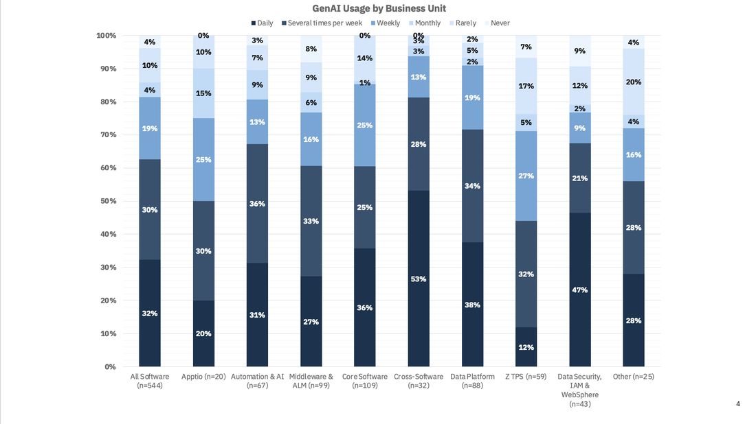
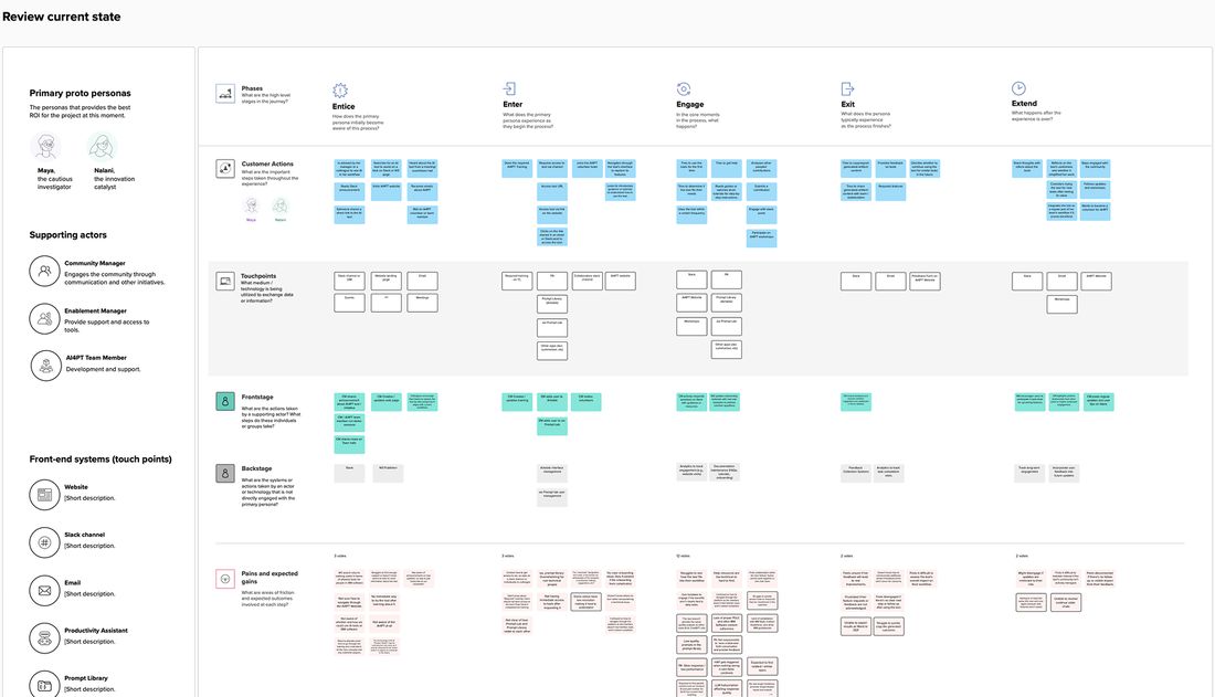
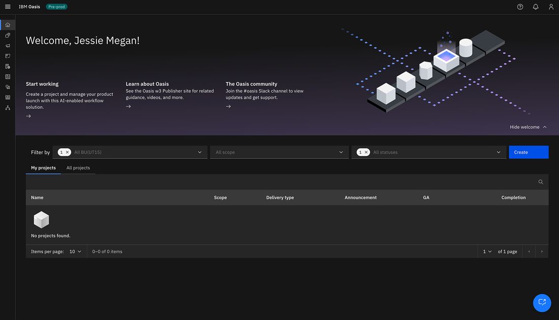
Sixteen months was not only this. The same question, what does this tool owe the person using it, ran through the rest of it.
03Key design moments
The feedback box was already the research
Before I ran anything of my own, I read what people had already written. The in-product feedback form had been open since launch and had collected around 140 entries. Nobody had read them end to end.
They averaged a little over three out of five, and the ones and twos were not vague. People were telling us the three problems in their own words, months before we named them.
That last one still gets me. A user, unprompted, named the design system by name. When people reach for that level of detail in a feedback box, they are not being difficult. They are telling you they wanted this to work.
From there I had enough to brainstorm against instead of guessing.
Seventeen people, and nobody clicked
The loudest complaint was that people did not know what the assistant was for, so I explained it. The onboarding was good. It was short, it was honest, it said what the tool could and could not do.
Then we put it in front of seventeen users and watched. Nobody read it. Not one person clicked to the second panel. They closed it, some without their eyes ever landing on it, and started typing.
Nobody had a problem with what the onboarding said. They had a problem with it being in the way.
That was hard to take, and it was the most useful hour of the project.
Force the panels, disable the chat box until someone reaches the end. It would move the metric and change nothing. You can make a person click Continue. You cannot make them read, and now they are annoyed before they have typed a word.
The gentler version of the same mistake. It is still a thing standing between someone and the box they came to type in, only now it interrupts them five times instead of once.
Stop treating the explanation as documentation that lives before the work. Put it in the agent's own first message, so it arrives after the person has chosen what they want to do, from the thing that is about to do it.
So the onboarding I had just built got deleted. Everything it was trying to say is still in the product, it just stopped being a separate document.
What an agent should say before it starts
Phase two was the agents themselves, and this is where design stopped being screens. I context-engineered foundation models into agents for real product tasks. Of the eleven that shipped, I led two end to end and contributed to four more.
Writing an agent turned out to be mostly writing. This is where the onboarding went. Every one of them opens the same way, saying the things those three panels were trying to say, except now it arrives inside the conversation instead of in front of it.
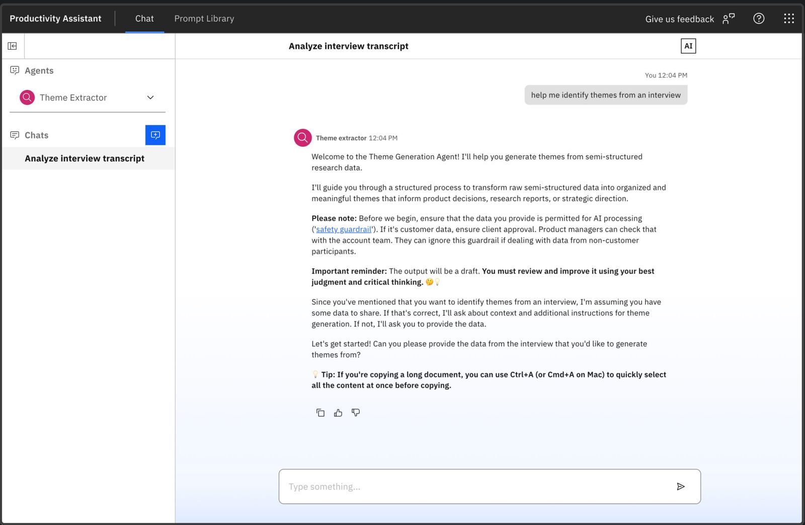 1You pick the agent first, so the whole conversation has a job. Context stays with it instead of resetting.
2It says what it is and what it will do, in one sentence, before asking for anything.
3The guardrail comes before you paste, not after. Check the data is allowed, and who to ask if you are unsure.
4This is a draft and you must review it. The hardest line to keep, and the one that makes the rest believable.
5A small practical tip, because the people who needed this most were pasting long documents.
1You pick the agent first, so the whole conversation has a job. Context stays with it instead of resetting.
2It says what it is and what it will do, in one sentence, before asking for anything.
3The guardrail comes before you paste, not after. Check the data is allowed, and who to ask if you are unsure.
4This is a draft and you must review it. The hardest line to keep, and the one that makes the rest believable.
5A small practical tip, because the people who needed this most were pasting long documents.
There was real pressure to cut that fourth line. It makes the product sound less sure of itself, and nobody wants their AI to open with a caveat. I kept it because an assistant that overpromises gets used once. The whole point was getting used twice.
The number that went up, and the one that did not
We released into three sprints: 10+ prototypes, 30+ releases, eleven agents. Usage went from almost nothing to around 1,100 messages a day.
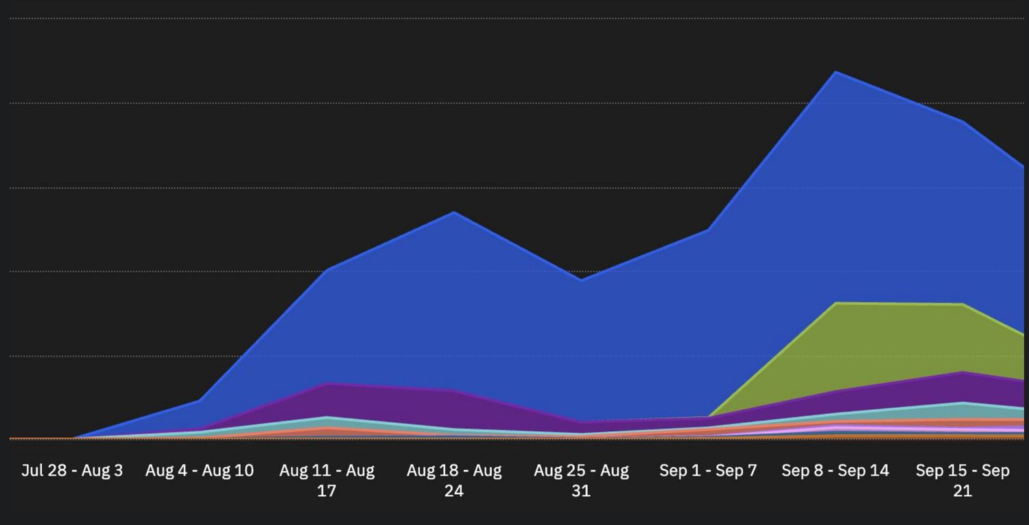
The average rating in the feedback box did not go up. I want to be straight about that, because it looks like a contradiction and I do not think it is one.
A feedback form is where people go when something annoys them. When almost nobody uses a tool, almost nobody fills it in. When 1,100 messages a day run through it, the form fills up with everyone who hit an edge. What changed was the shape of the complaints. Early ones were "I don't see much use of this assistant yet". Later ones were "the Aha connector is timing out" and "can it remember our standard personas". Those are the complaints of people who have started depending on something.
It is still the number I would hand to whoever picks this up. Adoption tells you people arrived. It does not tell you they are happy. The next honest measure of this tool is not how many messages it gets, it is how many of them are a second visit.
04Impact
Usage measured in production after launch. The agent count is what shipped, not what was designed.
The real change is smaller than the numbers make it sound. The assistant went from something people opened once to something they open on a Tuesday because they have an epic to write. The eleven agents cover work product teams were already doing by hand, so reaching for it is not a detour. It is the same job with less typing.
The part I hope outlasts me on it is one sentence. Every agent opens by saying what it does, what it needs from you, and that the answer is a draft you still have to check. Getting that into all eleven of them took more arguing than any screen in this case study, and it is the thing I would fight for again.
05Reflections
Testing is allowed to kill your favorite thing
The onboarding was the clearest work I did all year and seventeen people told me it did not matter. The right response was to delete it, not to defend it or make it louder. If people are skipping the explanation, the explanation is in the wrong place, and that is a design problem, not a reading problem.
Explainability is not a feature
Designing for AI is strange because the material keeps moving. What was true about the model in January was not true in June. The only thing that held still was the person. Telling someone honestly where the tool gets shaky is what makes them trust the rest of it, and it is the first thing everyone wants to cut.