Making cloud spend easy to read
SAP's finance teams watch over a billion dollars of cloud spend through one dashboard. It showed everything and explained nothing. I redesigned it so people could answer their real questions in under a minute.
Plutus
first design intern
Vancouver
01Overview

Plutus is the tool SAP's finance teams use to watch what the company spends on cloud services. In 2024 alone it helped SAP avoid over a billion dollars of cloud spend, and the year before it won the Hasso Plattner Founders' Award, which is the company's highest internal honor.
I joined as the team's first design intern, and for six months I was the only person on it whose job was how the thing felt to use. The first time I opened the dashboard I thought: whoa. It tried to show everything at once. Charts stacked in one long column. You scrolled down, forgot what was at the top, and scrolled back up.
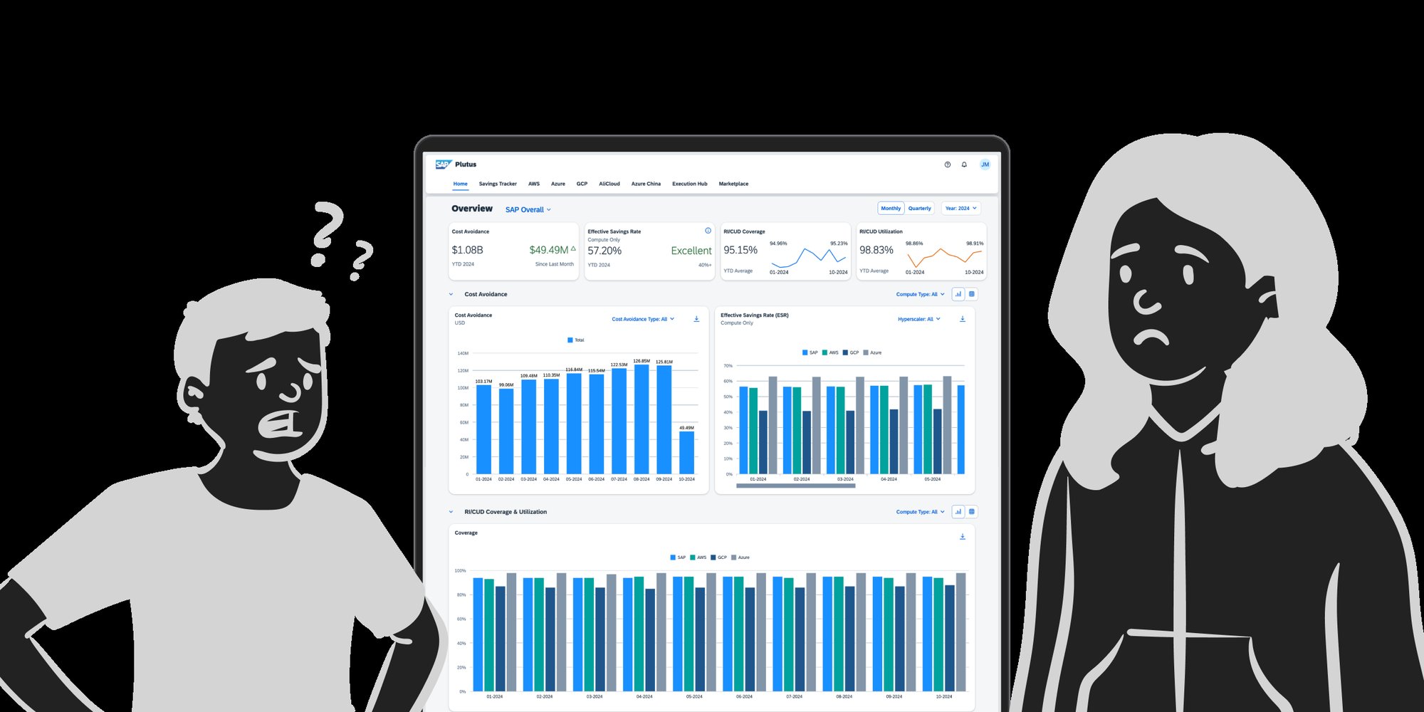
That is what it was costing. Answering one ordinary question, is spend up or down, who is driving it, took around ten minutes of scrolling. So people had quietly stopped asking the dashboard. They were stitching the answer together by hand out of scattered reports instead, which is the slow way a tool stops being used.
I was new and honestly a little lost. But I figured that if I felt lost reading it, the people who relied on it every day probably did too. That was enough reason to dig in.
How might we help a finance team judge how cloud spend is performing at a glance, and still go deeper when they need to, without scrolling to find out?
02What I made
Picture the first Monday of the month. A finance lead has a spend review in an hour and one question waiting for them: are we on track, and if not, who moved?
On the old dashboard that meant opening the page, scrolling, holding a number in their head, scrolling further to find something to compare it to, and scrolling back. Ten minutes later they usually had the number. What they did not have was any sense of whether it was good news. I designed everything against that hour.
Instead of one long page, the dashboard became two views with one job each. The first answers how we are doing. The second answers why.
A scoreboard for the quarter
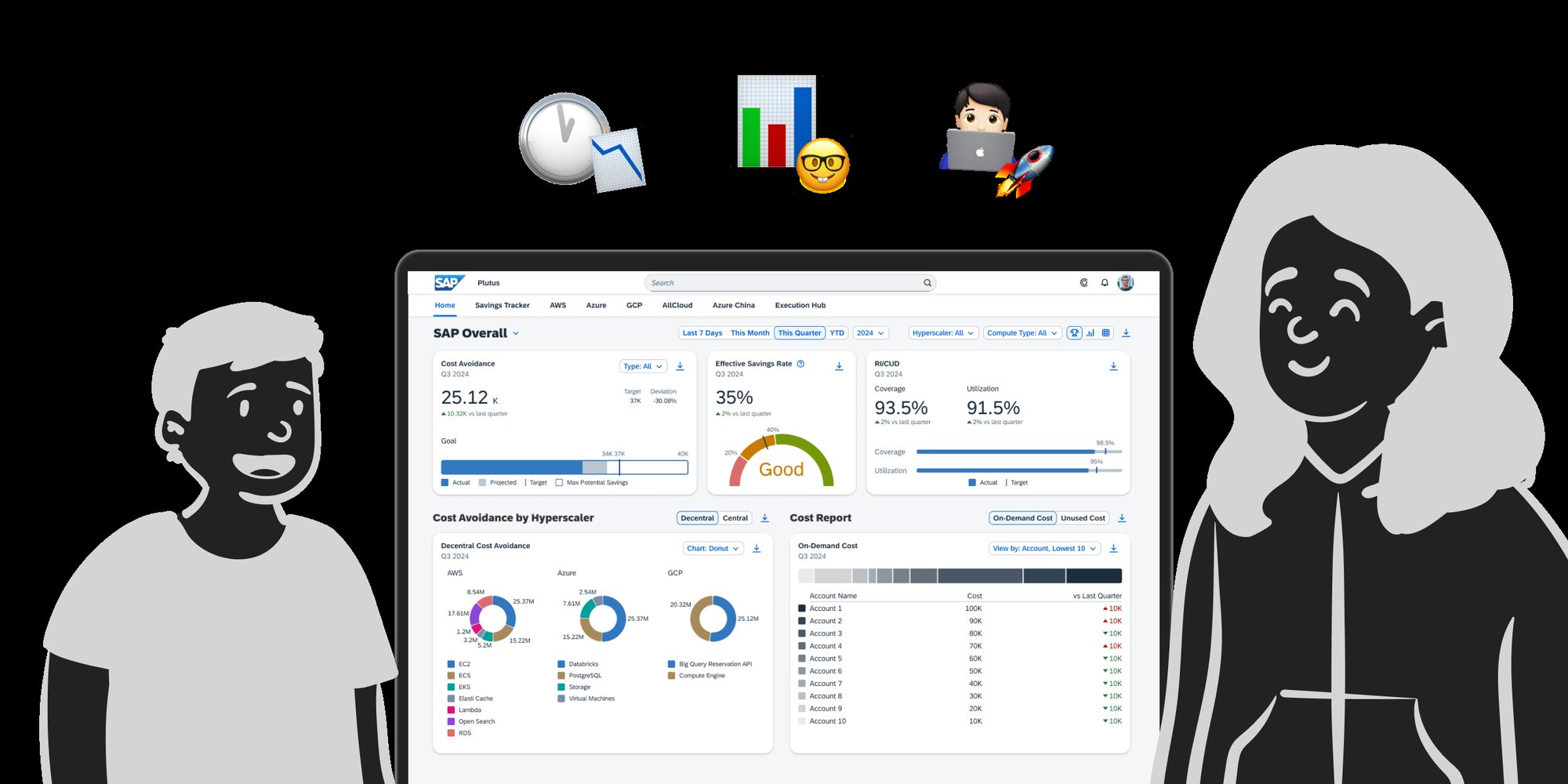
Each number sits next to the target it is being judged against, so you can see whether this quarter is on track and by how much, without opening a single report.
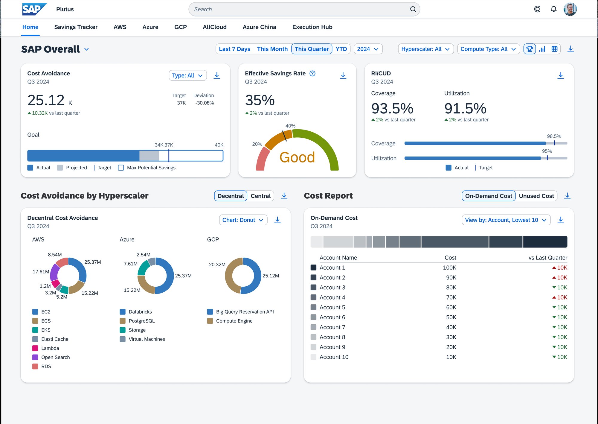 1Every number carries its target and the gap, so good or bad is readable without maths.
2One gauge for the headline rate, because people kept asking the same first question.
3Coverage and utilization against target, the two numbers finance asked about most.
4Spend broken down by provider, so the biggest mover is obvious on arrival.
5Best and worst accounts ranked, which is what people were building by hand before.
1Every number carries its target and the gap, so good or bad is readable without maths.
2One gauge for the headline rate, because people kept asking the same first question.
3Coverage and utilization against target, the two numbers finance asked about most.
4Spend broken down by provider, so the biggest mover is obvious on arrival.
5Best and worst accounts ranked, which is what people were building by hand before.
Somewhere to go deeper
The second view is for the follow-up question. It shows how spend moves over time and lets you break it down by the things finance teams actually ask about. Same metrics, same order, one toggle away, so nobody loses their place going from judging to explaining.
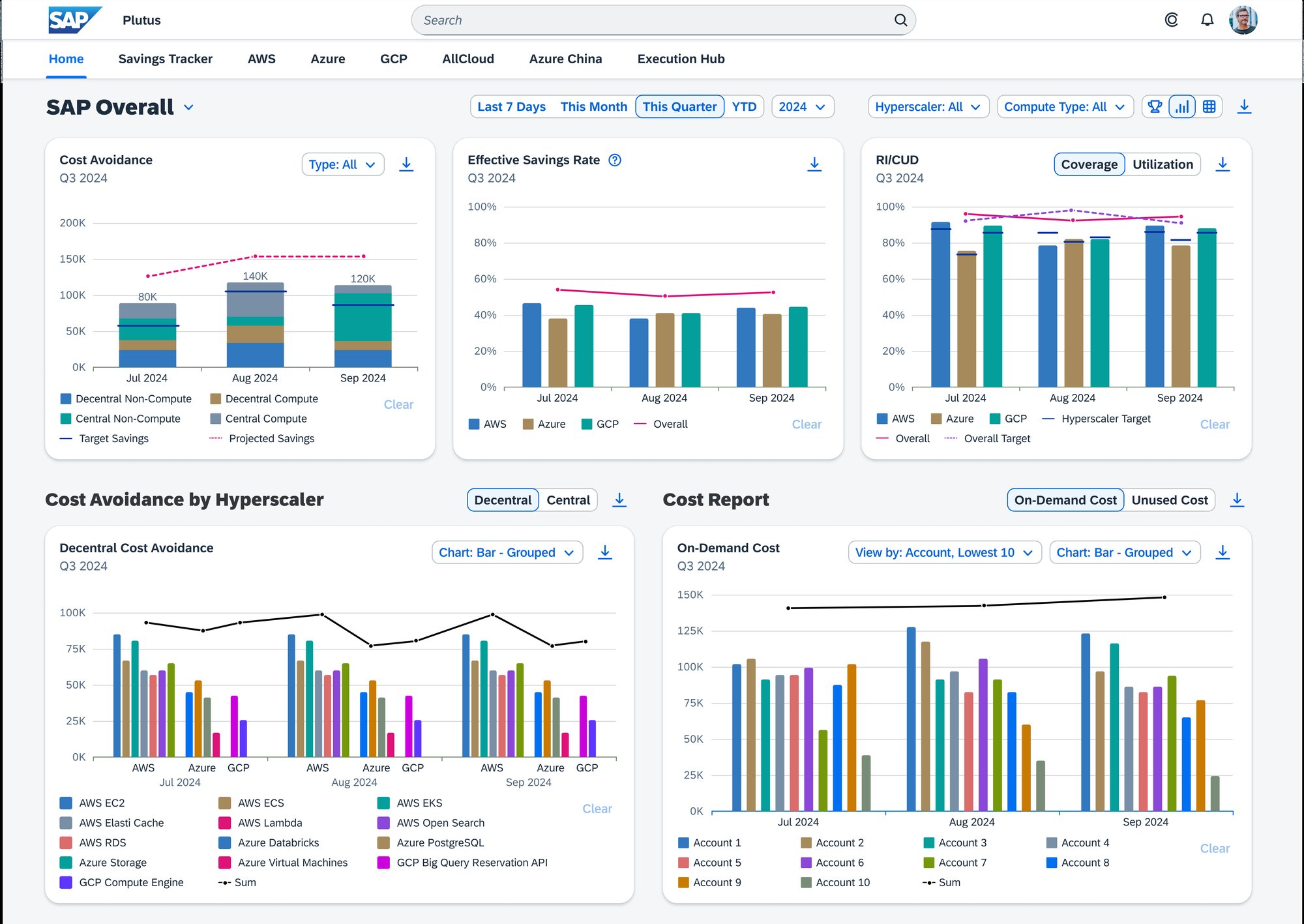 1One toggle swaps the whole page between the scoreboard and this. Same metrics, same order, different question.
2Every metric keeps its target drawn across it, so a trend is judged against something instead of floating.
3Each tile carries its own chart control, because finance and operations wanted to read the same numbers differently.
1One toggle swaps the whole page between the scoreboard and this. Same metrics, same order, different question.
2Every metric keeps its target drawn across it, so a trend is judged against something instead of floating.
3Each tile carries its own chart control, because finance and operations wanted to read the same numbers differently.
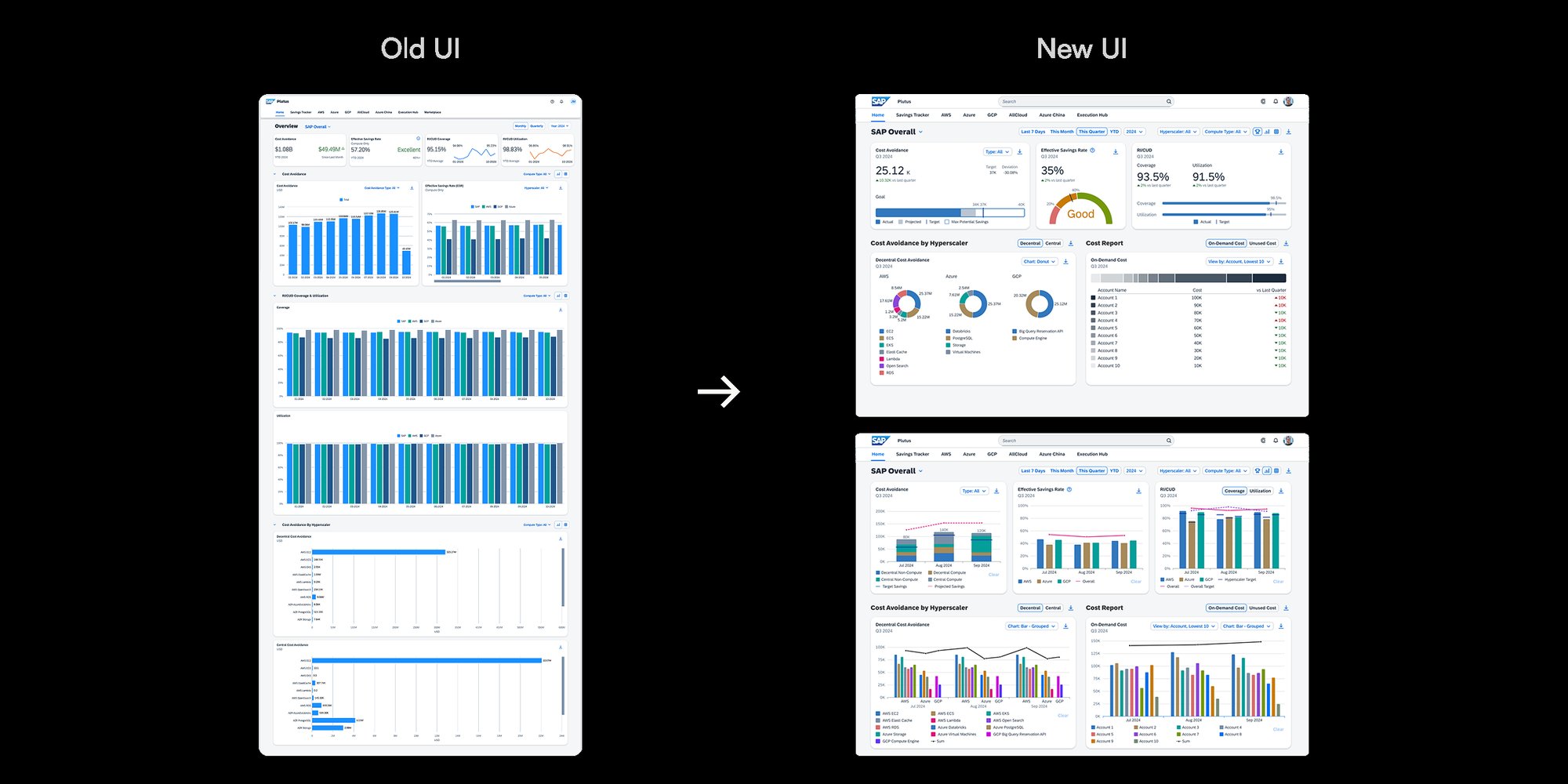
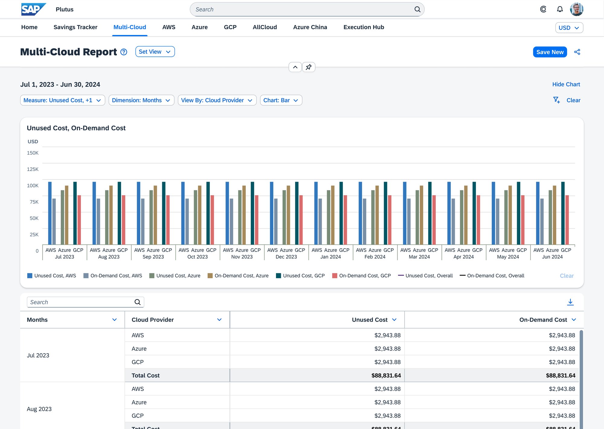
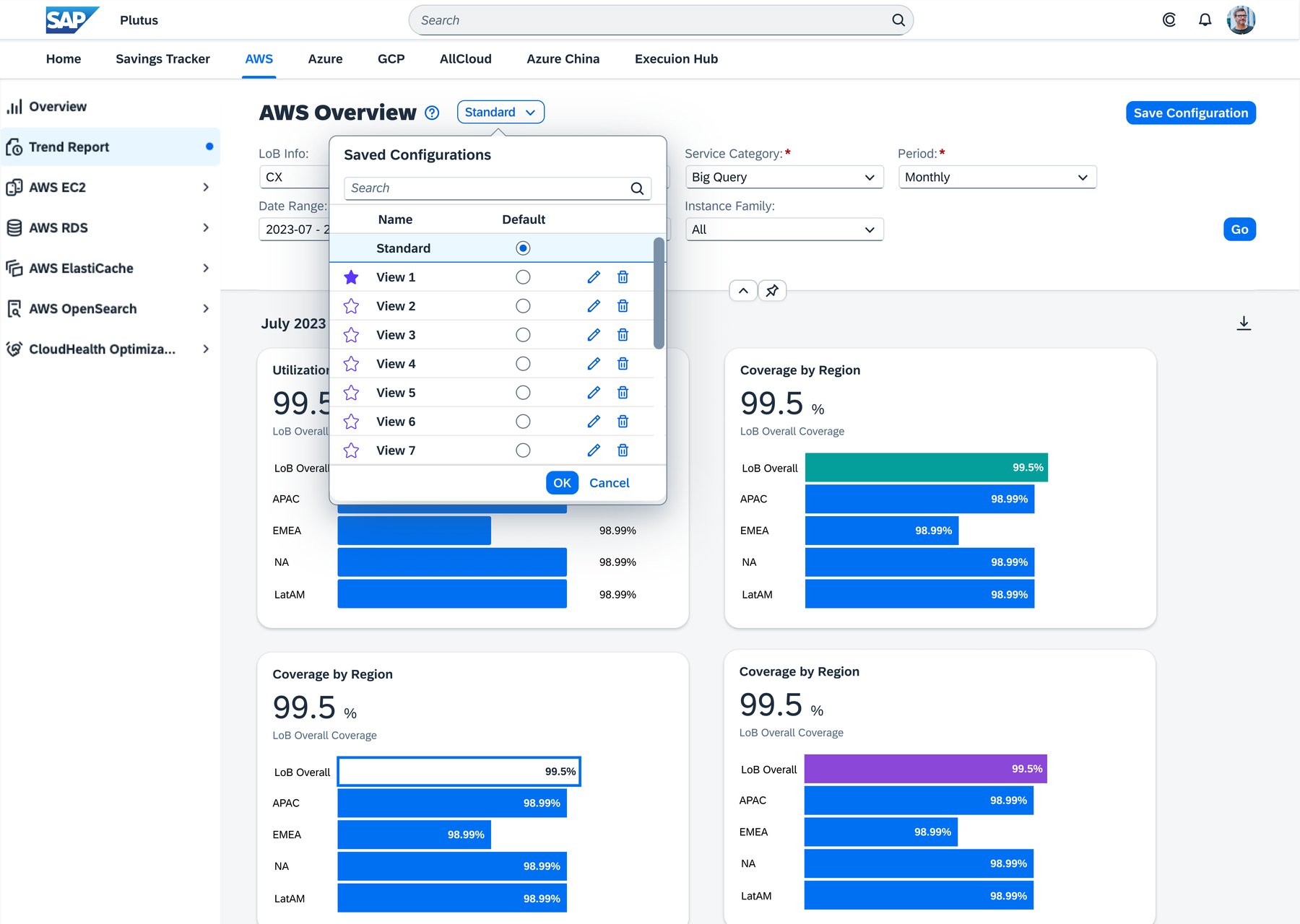
The dashboard was one of eight projects I shipped over six months. The rule behind it, every number next to the thing it should be judged against, went into all of them.
03Key design moments
An honest audit before any ideas
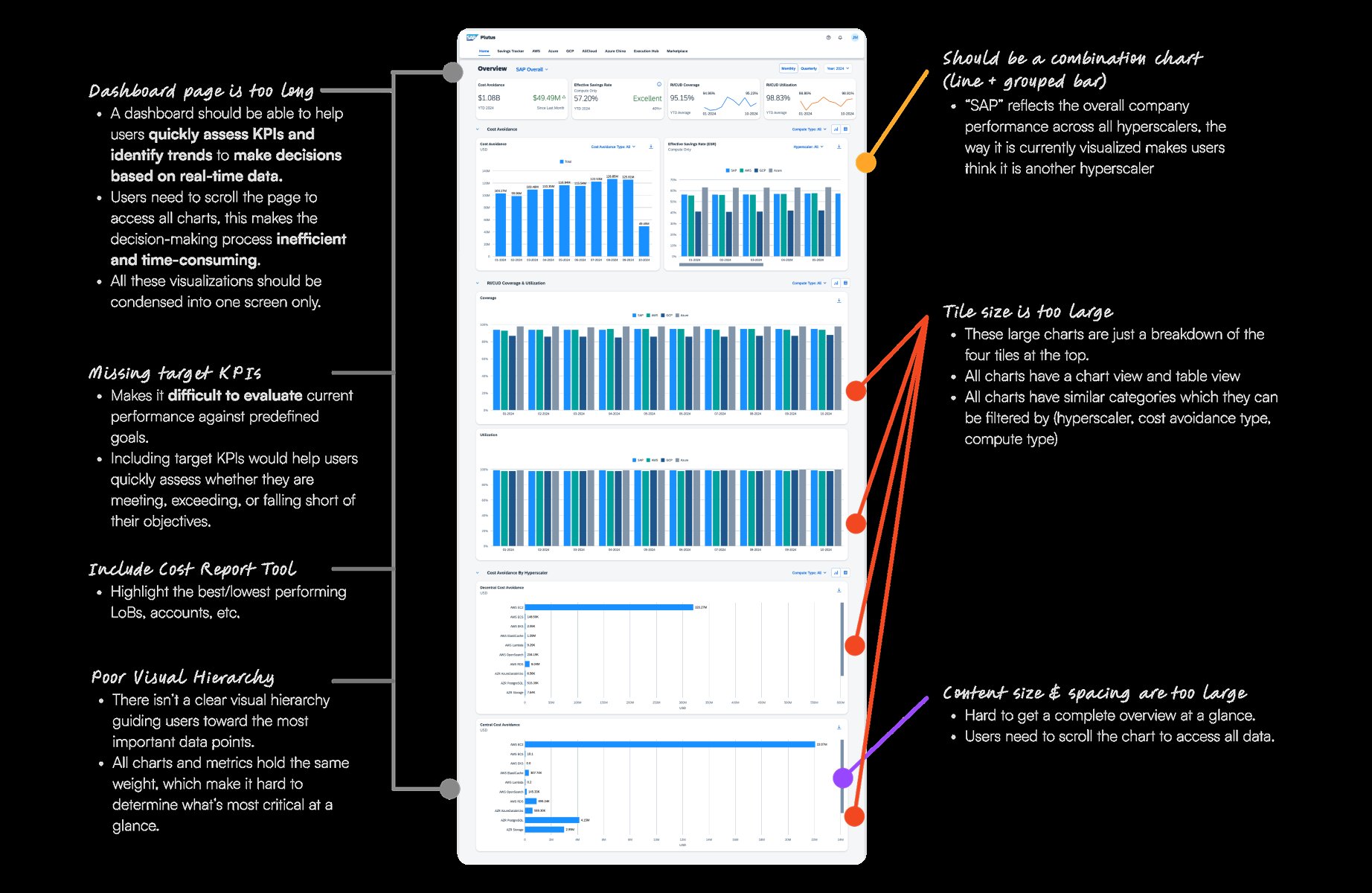
Before sketching anything I ran a heuristic evaluation of the old dashboard, screen by screen. Five problems kept repeating. Too much competing for attention, no clear hierarchy, charts with no context, no way to compare spend against targets, and the most useful insight buried at the bottom of the page.
I took it to my PM and the UX Design Specialist expecting to be told it was a later problem. Instead the redesign became the next sprint, and they handed it to me. It was the first time something I noticed changed a roadmap.
Everyone was asking the same three questions
I interviewed finance leaders and line of business managers, read up on dashboard patterns, and looked at how teams were tracking their cloud spend targets already. Everyone had a different job title. Nearly all of them wanted the same three answers.
All three are answered on the scoreboard above, in that order. The headline rate answers the first, the provider breakdown answers the second, and every number carrying its own target answers the third. Nobody needed more charts. They needed order.
The moment I stopped adding things
Halfway through I kept sneaking in one more chart, one more toggle, one more breakdown. More felt like better. Then one user said this.
If I can't understand the dashboard in 30 seconds, I'm moving on.A finance user, during research
That snapped me out of it, and it turned into a rule I could actually design against. Thirty seconds, or it does not belong on the first screen. From then on every decision came down to one question: what can I take away so the important things stand out?
One page, or two?
The thirty second rule forced the hardest call on the project. Finance needed a verdict in half a minute. Operations needed to dig for twenty. Those are two different jobs, and they had been sharing one page. This is the decision I spent the longest on.
The safe answer, and the one that changes nothing. Collapsing a chart hides it, it does not rank it. You still arrive at a page that tells you nothing until you start opening things, which is exactly the thirty seconds you do not have.
Tempting, because it looks tidy. But the three questions are not three separate jobs, they are one thought followed through. Splitting by metric means losing your place every time you follow it.
Judging lives in one, explaining lives in the other. The split is by question, not by data, so both views hold the same metrics in the same order and the toggle never moves anything under you.
That last part is the bit I would defend hardest. A toggle only works if the other side is familiar. Keeping the order identical across both views is what makes going deeper feel like leaning in rather than starting over.
Testing it with real people
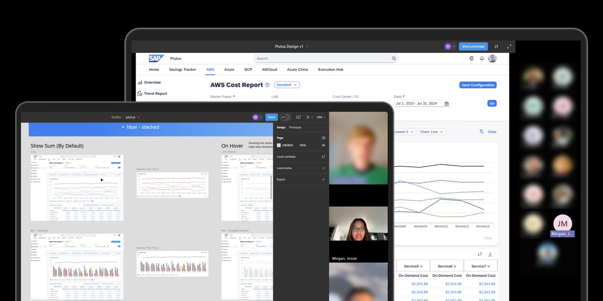
I tested the new dashboard with eight people across finance and operations, on the same tasks they had done on the old page. Most found what they were looking for, a spending trend or a team over budget, in under a minute.
The more useful finding was the gap between finding and believing. People located numbers quickly on both versions. What changed was whether they would act on them. The old dashboard was never wrong, it was just hard enough to read that people hesitated, and hesitation looks the same as not trusting it. Clarity was doing the work I thought speed was doing.
What I could not test in six months is whether the two-view split still holds when the number of metrics doubles. The scoreboard earns its thirty seconds today because it is short. That is the question I would hand to whoever picks this up next.
04Impact
This one is live. The redesign went into production and SAP finance teams use it every month.
Measured with eight people across finance and operations, running the same tasks on the old dashboard and the new one.
After launch I went back to the same people, plus a few new ones. Tasks that used to take around ten minutes took under three. Most said they felt more confident using the dashboard, and the spreadsheets they had been keeping on the side went away. The dashboard became something people could rely on instead of something they worked around.
05Reflections
Clear beats complete
I came in thinking a good dashboard showed everything the data could support. The thirty second comment killed that. A number nobody can find is worth nothing, and every chart I removed made the remaining ones easier to trust.
Not knowing is not the problem
Explaining decisions to engineers and stakeholders frightened me at first, mostly because I would not have every answer. It turned out that was never the job. Being clear, listening, and staying open beat having an answer ready, and the questions I could not answer on the spot made the design better.